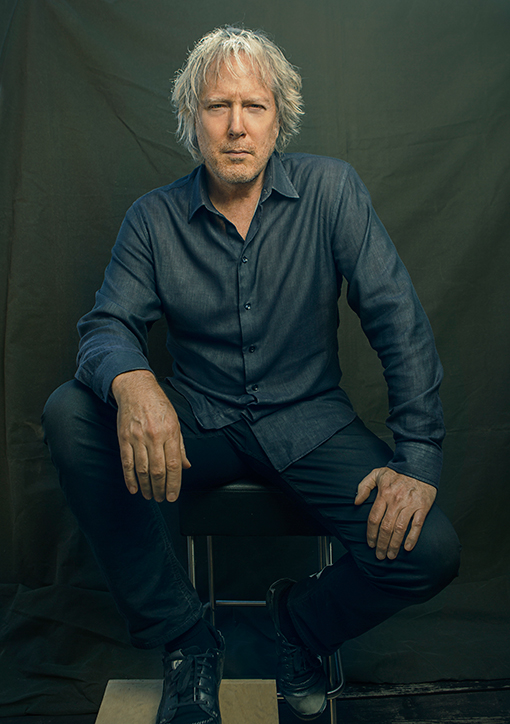
Rush Art Director Hugh Syme on the Stories Behind the Band's Iconic Album Covers and His New Book 'Art of Rush': Exclusive
By Gary Graff, Billboard, July 1, 2015
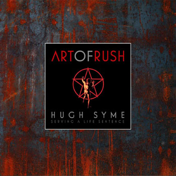 Forty years ago, Hugh Syme designed his first album package for Rush, 1975's Caress of Steel. That began what he happily calls "a life sentence," designing every Rush release - studio, live albums, compilations, videos - along with ancillary merchandise, backstage passes and more. With Rush out on the road continuing to celebrate its own 40th anniversary, Syme-a onetime keyboardist for the Ian Thomas Band who's also designed for Aerosmith, Megadeth, Iron Maiden, Whitesnake, Def Leppard and others - has compiled his work into a bench-pressable new book, The Art of Rush: Serving a Life Sentence. The 272-page tome, written with Stephen Humphries, comes in three versions and takes an in-depth look at Syme's thought process and interaction with the band, comments from all three Rush members and a foreword by drummer Neil Peart.
Billboard spoke exclusively with Syme about his 40-year-long relationship with Rush, the inside stories behind the band's iconic covers and how "they're deluding themselves into thinking this is a swan song." And then read drummer Neil Peart's foreword to Art of Rush, which Billboard is previewing.
How did you get the Rush gig back in '75?
I was pretty lucky. I was playing keyboards in another band on the same label and I was called down the hall, like the headmaster might do with a student, and I was asked if I might like to do an album cover for them. I was like, "Sure, I'll do a cover - [aside] LIke these guys are gonna last." (laughs). That led to playing with them on a few albums and just developing a kind of mutual respect on a lot of levels, and we just kind of continued.
 An uninterrupted 40-year relationship between a band and an art director is unusual. What's the glue here?
I was lucky enough to find a band that, first of all, paid attention. We're talking about a band that was emerging at a time when other bands were pretty taken by the idea they had to have a logo. But we were all pretty anti-logo. Even the Starman (from 2112) was an accident; we had no idea it would take on a life of its own like it did. But from the very beginning I could sense that this band wanted to make every album they do different, musically and thematically. I was just lucky enough to find a band that was willing to deviate from the norm every time, and that allowed me a lot of latitude to respond to each album as a unique event and not develop a (Roger) Dean sort of style like Yes did or a Phil Travers style like The Moody Blues did, even though those were really cool covers. We didn't adhere to any kind of template.
What's the process like when a new album comes along?
It's different now. In probably the last 15 years or so it's been very much Neil and me, him being the lyricist and the theme-meister. They gave me a lot of freedom to just respond to titles in the beginning. Later, as Neil became more and more aware of my process, he would anticipate and have more discussion about what I'd be doing, but never dictate. I think our relationship, still, is "Here's our title. Go away. Let us know what you come up with." But I do get more information. I get more guidelines, and we go to the titles of the songs so that we can develop the editorial images for each song and the like.
 You mention playing on some of the Rush albums. You came along at a time when Geddy Lee was starting to add keyboards to his arsenal. Were you ever called on to tutor?
No, but he was definitely paying attention. When he would come to my place and I would play pieces I was working on - and at the time I was so into (Genesis') Tony Banks and Keith Jarrett and so many people that inspired me - I could hear in his tone, "Oh, what's that?" "Just something I'm working on," and then he would sweetly sort of say, "Oh, fuck you!" (laughs). I could see the emerging keyboardist in him coming out as he developed a real keen ear and a reasonable hand for his sonic excursions. He's done an interesting job, I think, of bringing certain sonic elements to the forefront. I think he's worked well, and beyond, any limitations he had when he started.
 Do you have favorite designs you've done for Rush?
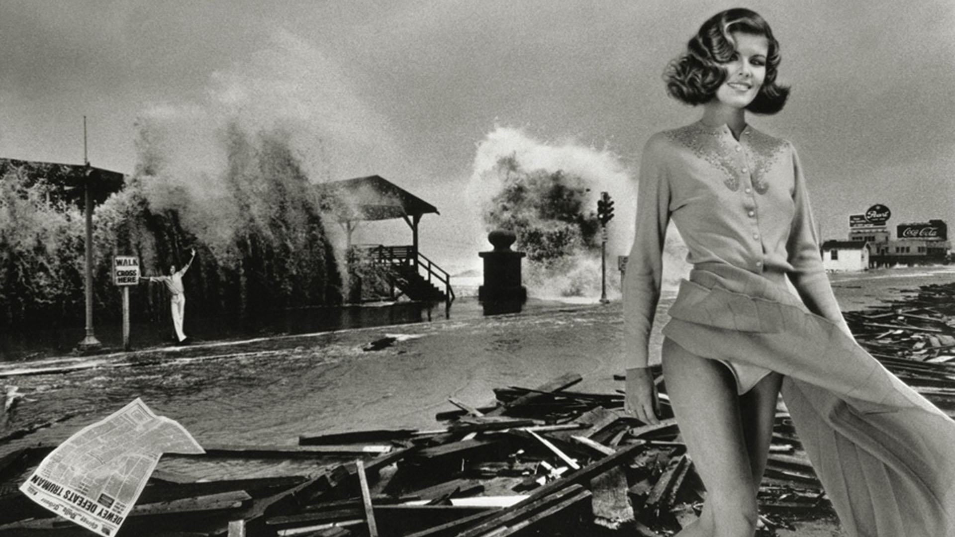
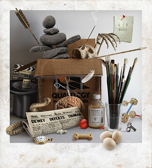
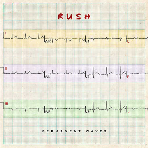
I tend to think more about technical prowess, so I'll probably err more towards the juggler for Hold Your Fire or inukshuk on Test For Echo. I quite like that cover, and it was fun to work on because I got to build that model and then photograph it and strip it into the scene. Power Windows is dear to me because I painted that in and around the death of my father, so it was cathartic for me. I like Counterparts for its glib simplicity. I think Signals was even more glib and ridiculous; it came after quite a few dead ends. At one point we entertained the idea of morse code and I was going to have the band each strapped into their own electroencephalograph equipment and have some technicians come in, and while they were recording and playing in the studio and snip a specific section of each of their heartbeats or brainwaves at a specific moment in the music. It was all getting too intelligent, so one day I said, "Let's just have a dog sniffing a fire hydrant."
The group has made some noise about the R40 tour potentially being their last, or the last of its kind, and even of ending the band in the near future. Any predictions from your perspective?
Well, I don't know. I've heard a few fairly firm final references - but not from the band. In a way I think what you're talking about is already in place; they used to do nine months and then take three months off, so I think they have scaled back consistently over the years. I think what they're doing now seems like a pretty manageable amount of dates for them. My feeling is there's going to be some kind of demand from Europe, and they always get such a great response when they go to Rio. So if they get the right kind of offers they may just do it because, what the hell, they want to and they can. But that's just me thinking out loud. I think as a band, letting go of their entire career and closing the doors is an improbability. I just don't see them kind of going gently, just ignoring music. I think something's going to happen in a couple of years, even if they're deluding themselves into thinking this is a swan song. I think they will do another album - I just happen to believe that.
Life Without The Possibility Of Parole
Neil Peart's foreword to The Art of Rush: Serving a Life Sentence, exclusively on Billboard.
 In early 1975 Alex, Geddy, and I released our first album together, Fly By Night. For its cover, I suggested an illustration I remembered from my bird-loving boyhood-a snowy owl flying toward the viewer. Thus I ended up on the phone from our Toronto office to the record-company art director in Chicago, describing the band's ideas. (We also wanted an airplane in the distance, to echo the title song's theme, and the northern lights because another title idea had been Aurora Borealis-probably shelved after young Americans we mentioned it to looked back blankly before saying, "Um-what?")
I had imagined the record company guy would search out the owl image I remembered, but he just said, "We'll make one like it." (Typical corporate dodge, I realize now!) Mercury Records was headquartered in Chicago, as was Playboy magazine in those days, and the Mercury guys always introduced each of their graphic artists and photographers with, "He works for Playboy"-which naturally impressed youthful males from the Canadian suburbs.
I never imagined I was taking on a role that would fall to me for the next forty years-but that notion would have been fine with me, too. Second to music, and maybe books, I always loved the graphic arts-drawing, painting, photography, and design. So it was a natural relationship. Within the band dynamic, apart from a shared involvement in the music, we each had our areas of interest and expertise-Alex the Musical Scientist; Geddy in charge of cinematic aspects like videos and live productions, and yours truly devoted to ink on paper.
 One day in the spring of 1975 I was in the North Toronto office of Rush's manager, Ray Danniels. Knowing of my interest and involvement in the previous cover art, he showed me an album called Delights, by one of his other clients, the Ian Thomas Band. Picking up the twelve-by-twelve LP cover (sweet memory of those!), I admired the deft drawing (the old man's face radiant with good humour-Ian's great-grandfather, Ray told me), and the combination of formal lettering for Ian Thomas's name and the playful intricacy of the title. To my taste, however unformed in those faroff days, all of the elements and their placements were so "right." I was already sensing Hugh's eye for proportion and "negative space"-seldom understood as representing luxury, as space always does to humans. Today I can define what I saw back then and only sensed: It was created with both talent and love.
When I told Ray that I admired the artwork very much, he said it had been done by the Ian Thomas Band's keyboard player, Hugh Syme. (Called by Ian, with his typical wry humour, "Huge Slime," a nickname which of course has endured, among friends.)
 From the first time Hugh and I met we shared a level of communication that would sustain us through all the years of discussing art by long distance-sometimes over the telephone from some recording studio in Wales or the Caribbean, and later by fax and email. We had the same values and tastes in images and design, and simply spoke the same language.
It is often overlooked that the term "fine art" actually comes from the French fin, final, or the end-as in the end or purpose of art is art, or "art for art's sake." (As 10CC noted wryly, "Art for art's sake/Money for god's sake.") This aesthetic ideal is distinguished from applied arts or performing arts, like Oscar Wilde's comment, "We can forgive a man for making a useful thing as long as he does not admire it. The only excuse for making a useless thing is that one admires it intensely."
Hugh and I shared that intense admiration for "useless things." Time and again we would fight against "the man" for an uncompromised fine-art approach to our work together, a battle that, alas, continues to this day. In working on recent book projects, for example, I have been shocked and appalled to hear variations on these words:
"We love the art, and showed it to the salesmen, and they think -"
Okay, really, stop right there. What is wrong with that statement? Just everything. Imagine being a young musician and hearing, "We love your music, and we played it for the salesmen, and they think -"
Not that that's a paranoid example anymore, you know it happens-but oh no, not here. However, Hugh and I know 'tis the way of the world, and we can but choose our battles.
 The first project Hugh and I collaborated on was Caress of Steel, in 1975. We brainstormed the ideas for its illustrations and layout, but as will be told, not all went according to plan. As if jinxed somehow, that album was fated to be "star-crossed" for the band in every way. It didn't sell, didn't get airplay, and spawned a tour of dwindling and depressing gigs that we and our crew came to wryly call the "Down the Tubes Tour."
But never mind-for Hugh and me, that album's crucible was the beginning of a long and richly symbiotic relationship.
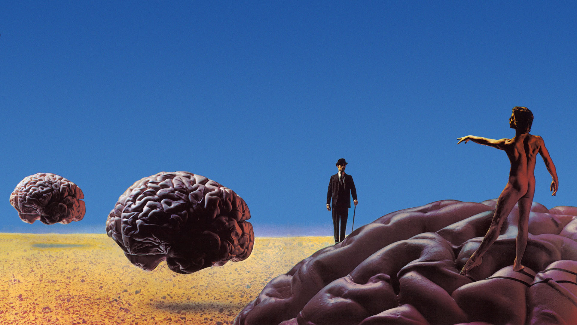
In the band's early years, it was necessary for us to make a few "experimental" albums, to find and define our common ground. We more-or-less arrived there (for the first time) in early 1976, with 2112. Conceived as an angry rebellion against corporate conformity ("the man"), it would be our first gold record. (Though that too was only validation from "the man"-the real treasure it gave us was freedom from meddlesome salesmen!)
It is likely no coincidence that 2112 was the project that really came together for Hugh as well. The bold, luminous front cover with its striking colours punched the viewer with the same uncompromising energy that the music expressed, while on the inside cover (after years of pleading we finally got a proper gatefold cover!), the Starman would become an iconic symbol for four decades. Although Hugh and I always rejected the idea of "logos," and constantly changed typefaces and images from one project to the next, that one star, circle, and naked man-the individual against oppression-has endured and recurred. It's just undeniable.
 For the 2112 album Hugh was also involved in the "soundtrack" aspect of the music, creating the spacy intro to the title piece on his ARP synthesizer, then contributing keyboards to Geddy's song "Tears."
Later cover designs came to include more of our shared sense of humour-the shameless puns of Permanent Waves, Moving Pictures, and Power Windows, for example. Signals, Presto, and Counterparts featured a dry, even sly humour, and then there were the "icon" covers, like Test for Echo and Clockwork Angels. I also have affection for the "quieter" ones, like Grace Under Pressure, Hold Your Fire, and Vapor Trails.
Summing up, I can offer no higher tribute than this: In four decades of my life and work, every recording, tour book, instructional DVD, or published book that has my name on it, has Hugh's name on it.
That's why I off-handedly referred to him one time as "serving a life sentence as my art director."
And that's why he will never be granted parole...
The Art of Rush can be ordered on the Rush website