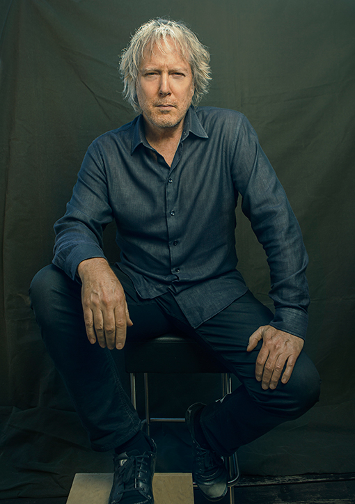
Q&A With Rush 'Starman' Hugh Syme
By Jason Draper, UDiscoverMusic.com, December 6, 2015
Hugh Syme: his name - and art - has been synonymous with prog legends Rush since 1975, when he designed the artwork for their third album, Caress Of Steel. Since then, he's created the iconic "Starman" emblem, which first appeared on Rush's 1976 classic, 2112, and has appeared on countless Rush releases since. Hugh Syme himself can also be seen on the artwork for Permanent Waves.
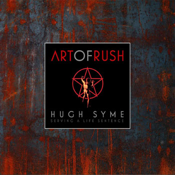
In 2015, Hugh Syme published Art Of Rush, a collection of four decades' worth of his artwork and illustrations for the group, with previously unseen images and a foreword by drummer Neil Peart. Collecting some of the finest artworks in the history of music, the hardback book can be purchased here. In December that year, uDiscover was lucky enough to talk to Hugh Syme, who shared some of his memories of working with "a band that dared to deviate from the norm".
How did you first get involved with Rush?
I was keyboardist, singer and co-arranger in The Ian Thomas Band, who were on the same label as Rush, and with their management, SRO-Anthem. Their manager, Ray Danniels, summoned me to his inner sanctum, where he asked if I'd consider designing a cover for Rush. I considered for a moment and then agreed, completely unaware that this would mark the beginning of a 40-year sojourn, beginning with Caress Of Steel.
How have you managed to keep the working relationship going for so long?
I believe that our longevity was maintained through a mutual dynamic: a band that dared to deviate from the norm was my kind of client! And they proved to be much more than that: friends, both graphic and musical.
Do you get carte blanche when it comes to creating artwork for them, or do they give you a brief?
At first, I pretty much did, yes. But, as Neil's lyrics became more and more thematic, the more the cover artwork was charged with the task of representing those themes - either specifically or obtusely, but, one hopes, always entertainingly.
What have been the challenges of working with a band as prolific and varied as Rush?
It's been less a challenge, more a joy, really. As an art director, what more could I ask for than variety? Both stylistic and thematic...
What was your favourite album to work on?
They were all fun to work on, to be honest. But painting the Power Windows cover was a special experience, and a special time in my life.
What album did you find the most challenging to represent visually?
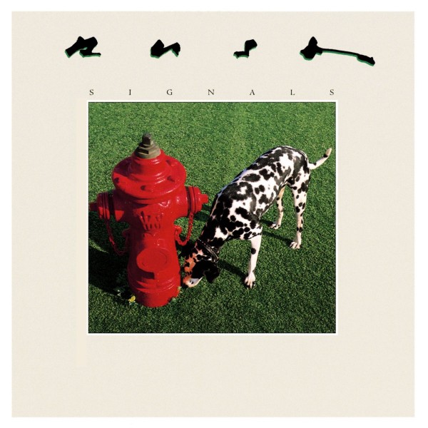 Signals was just so open-ended as a concept, it was intimidating. We had some trouble trying to determine the right direction: literal, metaphorical, whimsical, silly... We chose the latter. We had lofty notions of bringing in technicians and hooking each band member up to his own electroencephalogram, and recording their brainwave and heartbeats at the same measure of a given performance in the recording studio, then displaying each on the cover as a unique graphic. This all proved all too serious in the end, in light of the band's favourable response to the dog and the hydrant concept. I'm pleased we followed our gut.
And which, looking back, do you wish you'd done differently?
Not so much differently, but with the skill set I possess today... Hemispheres, probably.
What's the history behind the "Starman" emblem? What made you come up with it?
The evolution of the star and man was Neil's and mine's first true collaboration. He simply described the Red Star Of The Solar Federation as being all that is contrary to free thought and creativity, and the man as our hero. I simply combined the two. Never was this intended to be the band's brand or logo, with such a strong and enduring association with all things Rush.
How many of their albums has it appeared on in total?
I lost count. Its debut was, of course, on 2112, and it mostly appeared on retrospective or live releases thereafter: Archives, Retrospectives I and II, Exit... Stage Left and Moving Pictures. It was also Neil's kick drum art on All The World's A Stage...
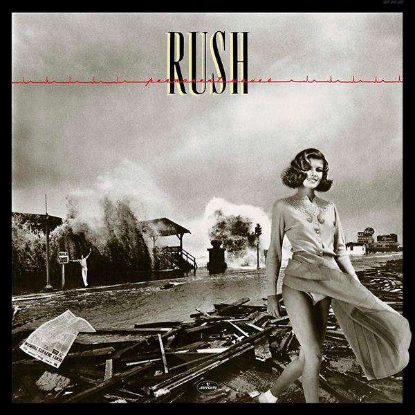
The Permanent Waves artwork is a masterpiece of collage art. What was the story behind it?
Thank you for those kind words. Considering that it was created with traditional film-composite methods in the darkroom, and bleach and dye retouching, I have always been pleased with it. The cover marked our first foray into the realm of visual puns (one hopes sophisticated, however glib). Permanent "waves" hairdo; permanent "waves" of the tidal type; irony in the printed "wave" of political optimism in the Chicago Tribune's presumptuous (and premature) headline [the newspaper infamously claimed "Dewey Defeats Truman" on the front page of its 3 November 1948 edition, when Harry S Truman actually won the presidential election]; and, of course, the twit standing under the wave in the background.
Who were your influences as an artist?
There are many: Vermeer, Dalí, Joel-Peter Witkin...
What other album cover artists have you admired over the years?
Being an early Moody Blues fan, I appreciated the work of Phil Travers and, of course, Roger Dean's work on Yes' covers. Also, Hipgnosis and their work, notably with Pink Floyd.
How has creating album artwork changed over the years - both technologically speaking, and also with the format shrinking in size, from LP to CD and digital formats?
The technology has remained the same, really: ink on paper. The downsizing presented some new considerations (both challenges and opportunities), which were at first unwelcome, as we designers all lamented the loss of the 12" x 12" canvas. But the CD booklet was the window that opened as the vinyl door was closing: all those pages to incorporate art into - not a bad thing, really. And, with the recent resurgence of vinyl, we can still have it all! As far as the 5" square CD cover was concerned, designs needed to simplify and be compliant with the new diminutive frame of reference. A whole era of iconographic thinking arose for album cover artists. Many of the more complex and ambitious vinyl covers of the 70s didn't translate so well in their reissued form as CD covers.
Which album cover, from any artist and any time, do you wish you could have designed yourself?
Sgt Pepper's Lonely Hearts Club Band.
Is there much unreleased Rush music that fans might not know about?
I think Rush were unique in this regard - not like others, who might write 40 songs and select 12 for their album. Rush were very focused on both the music and lyric content for each project as a complete work. Now, my cover comps and alternative cover ideas - that's a different matter!
The R40 Tour never came to Europe. Do you think European fans will ever get the chance to see the band live again?
Ask Rush. If I were to conjecture... I think a creative organism will, by its very nature, need to create - eventually. Time will tell. But it wouldn't surprise me if Rush were to embark on another studio album in the future. Maybe not tour as they have in past years, but perhaps a pay-per-view, simulcast, or an international theatre event, as Fathom Entertainment does with the Metropolitan Opera in New York City. Nationwide access to a multi-camera show, in 5.1... at a theatre near you!
And what's next for you as an artist?
I continue to keep busy with projects - both commercial, and personal. And I continue to work on albums, as those (select) projects arise.