Rush Album Art: The Stories Behind All 19 LP Covers
By Ryan Reed, UltimateClassicRock.com, January 13, 2021
(originally published as 20 seperate stories with the titles and dates listed below)
How Rush's Debut LP Cover Perfectly Matched Their Raw Songs, December 24, 2020
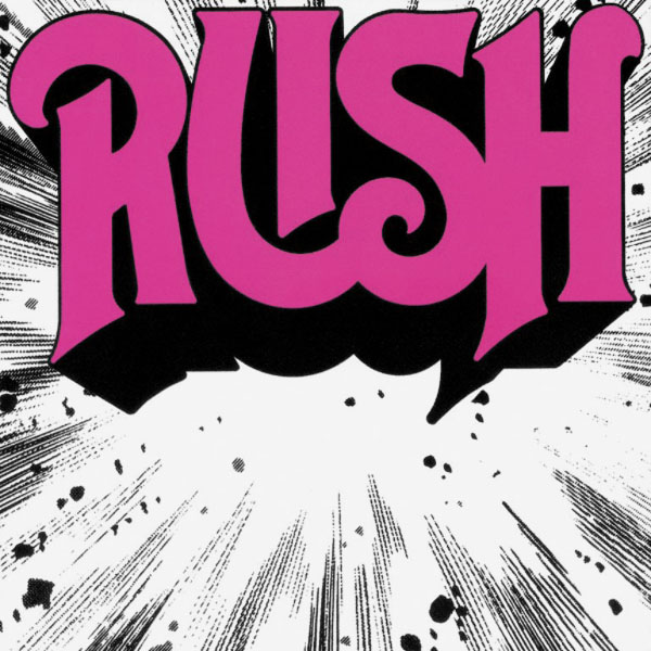
Some albums deserve a lavish gatefold with surrealist art allusions, much like Rush's 1978 LP, Hemispheres. Others, like the prog-rock band's raw 1974 debut, need just the bare essentials.
Rush is one of only two covers in the band's canon not art-directed by visual wizard Hugh Syme, who took on that role starting with 1975's Caress of Steel. But it's still one of the group's definitive pieces, expertly summarizing the sounds within the sleeve.
It doesn't get much simpler: the band name - in bold, regal block betters - seemingly crashing into the frame like a meteor, leaving debris in its wake. (The original Moon Records pressing had "Rush" in red lettering, but the later Mercury versions featured a pink-ish hue.)
Paul Weldon's design conveyed the primal power-trio energy of early staples like "Working Man" and "Finding My Way," as he noted in Jon Collins' 2005 book, Chemistry. "I used the explosion graphic because I felt that it represented the nature of the band," he recalled. "For a three-piece group, they had a lot of power and force in their sound."
The simplicity was also a practical matter. As Weldon noted, "In Rush's early days, they didn't have much money and so I kept it to a [two-color scheme]."
After adding drummer and lyricist Neil Peart in mid-1974, Rush quickly expanded their music into proggier, more philosophical territory. In that sense, Rush is an outlier in their catalog - a primitive baby step that hardly previews the majesty of their classic work. The cover, however, remains iconic - a sort of de-facto visual trademark.
"The first album cover was very commercial with its bright explosion and the logo," bassist Geddy Lee recalled in Syme's 2015 book, Art of Rush. "You could tell that the record company was already thinking about a logo."
How Rush's New Drummer Neil Peart Helped Spark Fly by Night Art, December 25, 2020
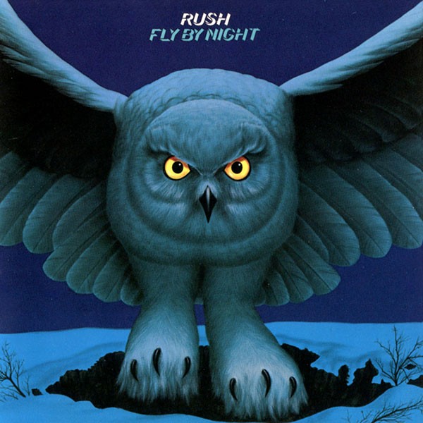
Neil Peart made his drumming and lyric-writing debut with Rush's second LP, 1975's Fly by Night. He also took on another, less famous role: conceptualizing its bold cover image.
"One of the first lyrics I submitted to [guitarist] Alex [Lifeson] and [bassist] Geddy [Lee] was 'Fly by Night,' and when the time came to make our first album together, we decided that was a good title," Peart wrote in the introduction to The Complete Tour Books 1977-2004. "As a bird lover since childhood, I remembered an illustration of a snowy owl swooping down toward the viewer with fierce eyes, and I suggested an image like that for the cover, maybe with the northern lights in the background."
The prog-rock trio was still a few months away from hiring art director Hugh Syme, who'd contribute to every subsequent Rush LP, starting with their follow-up, Caress of Steel. That temporary role fell to Jim Ladwig and AGI Chicago, with the visual crew rounded out by designer Joe Kotleba and painter Eraldo Carugati - the latter of whom later worked on the four Kiss solo albums from 1978.
Together they brought Peart's simplistic idea to life. But the drummer still had to do the early legwork.
"It fell to me to talk on the phone to the record company artist in Chicago and try to describe this picture in words," Peart recalled. "In the same way that writing those few lyrics for the band would lead to me becoming the band's chief wordsmith, that phone conversation led to me becoming the 'graphic arts supervisor.'"
The cover isn't a major work in the Rush catalog - far from the intricate, often philosophical designs Syme would cook up in the late '70s. But that owl's eerily yellow eyes added a hint of mystery to Fly by Night, mirroring the album's gradual evolution from pure hard-rock into a proggier, more imaginative sound.
Why Rush's Record Label Changed the Caress of Steel Cover Art, September 26, 2020
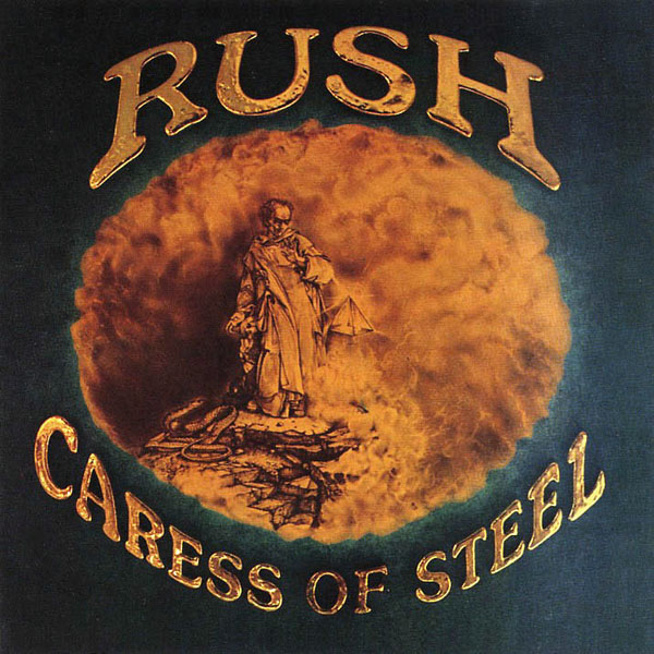
As Rush's art director since 1975, Hugh Syme designed some of the prog-rock band's signature images: the glowing Red Star of the Solar Federation that adorns 2112, the visual puns of Moving Pictures, the scene of cheerful destruction on Permanent Waves.
But in retrospect, he isn't completely satisfied with his work on Caress of Steel, the first of their numerous collaborations. Mostly, he says, because the record company made some last-minute alterations to his image, which shows a wizard-like character flanked by a coiled snake and mysterious triangle.
"I was a huge [M.C. Escher] fan," Syme tells Ultimate Classic Rock. "My original drawings were in pencil: clean, monochromatic, simple homages to Escher. But when the record label got ahold of these, they thought it wasn't rock and roll enough, so they added this chromium lettering and swung the tint of the whole image over to a brown sepia tone - none of which was requested or under my purview at the time."
But there was one positive to the annoying interference: future creative control.
"When the band said, 'What happened?,' I said, 'I don't know,'" he adds. "That began the premise that they would consider most A&R people attending their sessions - and, more so, their comments - as unwelcome. Because they weren't interested. And when they realized that other people were meddling in the process when it came to my art, they said, 'Don't listen to anyone. We're talking to you directly.' That set up a feature in my life."
Looking back, Syme's supernatural image is a fitting match for Caress of Steel, Rush's first full-blown foray into prog. The artist doesn't count it among his finest covers, but he realizes it "served its purpose."
"That album worked out well. I don't look back fondly on the outcome, but that's OK," he says. "It was more just me being indulgent - art directors are pretty selfish. We do what we want to do, and what a gift it was to work with a band like Rush. They - excuse the quote - allowed that deviation from any norms because that's what they aspired to do themselves as artists."
How Rush Wound Up With a 'Marquee' Cover for 2112, November 25, 2020
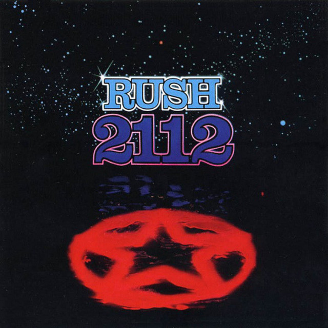
"The tail wags the dog," says Hugh Syme, reflecting on his "marquee" cover for Rush's 1976 LP 2112.
That's a reliable refrain from the band's longtime art director. As he notes, it's a fool's errand predicting which images will become iconic - time alone can tell that tale. And in this case, he modestly deflects praise for the sleeve, instead redirecting credit to the prog-rock trio's ambitious fourth album - particularly "2112," the side-long, 20-minute sci-fi epic exploring themes of liberation and oppression.
"If you ask me, as an artist or an art director, how I feel about the cover, I look back on it as being pretty formative, pretty primitive," Syme tells UCR. "But I realize that I somehow intuitively managed to tap into my conversations with [drummer-lyricist] Neil [Peart] about the arc of his story: the content of the hero confronting the evil red star and the Solar Federation."
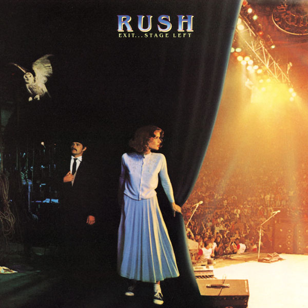
The cover features the glowing star and a galactic backdrop, with the band name and album title hovering above. Ironically, the signature piece is found inside the gatefold, where the "Starman" character - depicted by Syme's "bare-assed" friend Bobby King - stands defiantly against the looming star. (King became a semi-fixture of Rush covers: "He showed up again in the wings of Exit...Stage Left, and he was also the prime mover - no pun intended - for the Moving Pictures cover," Syme says. "I made good use of his good will...and his cheap modeling fees.")
Syme notes that he "didn't ignore" Peart's lyrical concept with the cover, but the end product wound up giving more real estate to text. "It's one of the few covers I'd call a 'marquee,' where the title occupies most of the space," he says. "Management loved it for that very reason. It's as my grade seven art teacher used to say: 'Fill the space.'"
Even though Syme doesn't consider 2112 one of his definitive works, it remains one of the band's most famous: The "Starman" later appeared on several other Rush covers: It hovers above Peart's drum kit on their 1976 live album, All the World's a Stage, and if you squint, you'll see it displayed in one of the paintings hauled around on 1981's Moving Pictures. It's essentially a band logo - and Syme says the merchandising numbers prove its enduring popularity.
"It certainly found its place in history because of the music," he says. "It's recognizable in its association with that lovely album. I think the music plays heavily into any merits that people attribute to the art itself."
"My favorite [comparison] is the Blind Faith cover with the crudely cut out girl with the art deco hood ornament airplane thingy [on their self-titled 1969 album]," he adds. "It's a pretty primitive technical feat, but a memorable and impactful cover. I think certain elements in art find their place in history - in this case, it's more born of the music, and the cover follows suit."
Rush’s A Farewell to Kings Cover Art Traded England for Buffalo, October 10, 2020
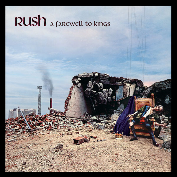
Hugh Syme originally envisioned an even more grandiose cover for Rush's 1977 classic, A Farewell to Kings. But in a development not uncommon in the analog era, feedback from band management altered those plans.
As he tells UCR, Syme, the prog-rock trio's art director since Caress of Steel, grew up in England "on the flip-side of the British Invasion," and he'd glimpsed some "beautiful ruins" that would have been perfect to capture for their fifth LP.
"[I'd seen] Lindisfarne, which is the monastery on Holy Island," he says. "This was all pre-Google, pre-accessing a wealth of images as possible backgrounds. You had to think in a different way back then. I would have loved to feature Lindisfarne - and I used it in my original sketches. But as soon as I showed that to the band's management, it was like, 'Yeah, dream on.' It was not a time for excess."
Instead, Syme drew on his immediate surroundings and came up with a new plan. The vivid final cover features a puppet-looking king slumped on a throne in front of a demolished building, contrasted with the Toronto skyline in the background.
"I found a building that was in a state of ruin in Buffalo [N.Y.]," Syme says. "I lived in the Niagara region and went into the U.S. a lot. I saw this beautiful, dilapidated building and thought, 'Well, we'll have access to that.' We crossed the border with Josh Onderison, the guitar player from my band, the Ian Thomas Band, which was on the same label as Rush and Max Webster. Our guitarist was of a skeletal stature - perfect for the puppet."
He retouched some elements of the character - including his mouth, jaw and eyes - in post-production, adding the sky, smokestack and strings. "I created a prosthetic structure so his knee, showing through the tear in his tights, appeared mechanical, like a marionette's," he says.
Syme was a massive fan of Hipgnosis, the renown design group who worked regularly with Pink Floyd and Led Zeppelin, among many others. And that inspiration seeped into his approach on A Farewell to Kings.
"I was inspired by composite work by those guys and endeavored to bring some of that to play in that album," he says. "And Hemispheres too, quite evidently, was affected by that inspiration."
Rush’s Hemispheres: How Philosophy, Surrealism Inspired Cover, October 27, 2020
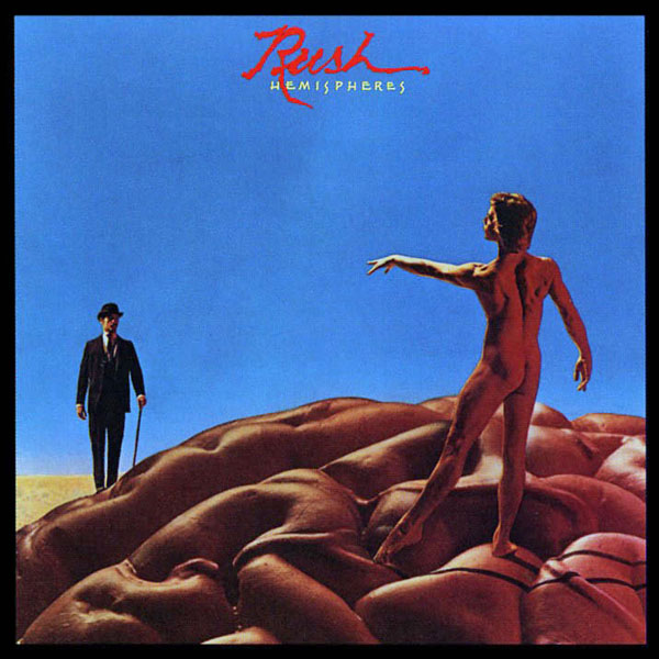
There were a lot of naked male buttocks on prog-rock album covers at the tail end of the '70s - namely, Yes' Going for the One and Rush's Hemispheres. But it was all a coincidence.
"I never made the connection," Hugh Syme, Rush's art director since 1975, tells UCR.
Instead, his vivid design for the power trio's proggiest record evolved from intimate conversations with drummer and lyricist Neil Peart - their regular routine by that point.
"A lot of [the discussion] was on the phone," he says, noting that Rush recorded their instrumental tracks at Rockfield Studios in Wales. "It was one of the more long-distance endeavors. Normally, if we were in Toronto, we'd hang out and talk about the cover. In the early stages, [bassist] Geddy [Lee] and I would also get together to talk. And then eventually Geddy and [guitarist] Alex [Lifeson] got too busy with the music. Neil was still in lyric-concept mode, so that became the default alliance, which worked well for 40-some years. But on that album, there was a lot of discussion about Dionysus and Apollo and the left-brain, right-brain [theory]. We have a calculating side of our nature, and we have a free-spirited [side]."
Syme was inspired by the suit-clad man on Belgian surrealist Rene Magritte's 1946 painting The Son of Man, and that figure folded perfectly into their conceptual framework. "[Peart] was a huge Magritte fan, too," he adds. "We discussed the [stoicism] of that man."
The final image features a distinguished fellow - played by Syme's longtime friend Bobby King - standing rigidly on one side of a brain, with a nude, elegant man on the other.
"We had this guy in a leotard, which just didn't suit rock 'n' roll," Syme says of the latter model, who'd been studying at the Toronto Ballet School. "But it was also a big gamble to say, 'Will anybody embrace a bare-assed guy on a cover?' It was a nod to the free spirit unshackled by clothing and that sort of thing. That became the device for creating contrast."
Syme had previously employed one of the Hemispheres models for a nude Rush pose - ironically, though, it wasn't the ballet student.
"Bobby was also the willing bare-assed character for the Starman [on 2112]," Syme says. "He came back to be the Magritte character. He showed up again in the wings of Exit...Stage Left, and he was also the prime mover - no pun intended - for the Moving Pictures cover. I made good use of his good will...and his cheap modeling fees."
How Rush’s Permanent Waves Cover Fused Storms and Retro Hairdos, December 30, 2020
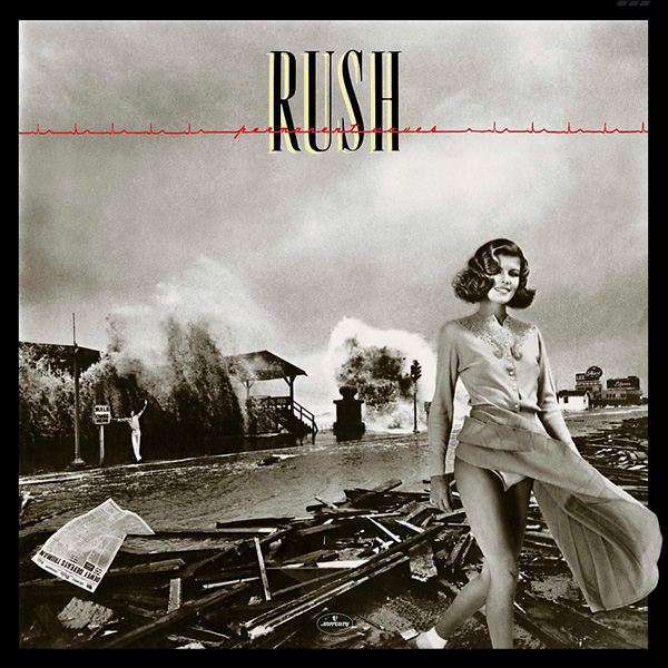
Severe storms, retro hair styles and erroneous newspaper headlines all factored into the memorable cover for Rush's 1980 album Permanent Waves.
This was the first of the prog-rock band's many LPs - including the very literal art for Moving Pictures - designed around visual puns. Longtime art director Hugh Syme filled the image with maximum varieties of "waves," tapping into fashion, weather and politics.
But the original, ultimately abandoned concept was less playful and more highbrow.
"At one point, I said we should bring in medical technicians with electroencephalogram equipment and tape the sensors onto the temples of each band member while they record a given passage of music," Syme tells UCR. "[We] could isolate the brain waves and heartbeats of each member. That way, we would have a graphic representation of how they corresponded to each other dynamically in a visual, physiological presentation."
The aim, Syme notes, was to be "all growed up" on that cover, moving toward the "cerebral" by showing those "three disparate graphs." But after they discussed the idea further - and "stumbled upon [his] glib puns" - they abandoned that concept altogether.
"We covered a few bases in our conversations," Syme continues. "I remember saying to the band, 'We should have a girl with a permanent Toni hairdo, which was a DIY product women used to use in the '50s and '60s when they chose not to visit the salon to curl their hair.
"I mentioned the girl and the hairdo and that she should be walking out of a tidal wave - and there could be some twit in the background, waving – and maybe there's a newspaper blowing through the scene with an erroneous, and ironic headline," Syme adds. "And that's when Neil [Peart] reminded me of 'Dewey Defeats Truman.'"
Peart was referencing the 1948 Chicago Daily Tribune issue that incorrectly reported the U.S. presidential election results. Syme originally incorporated that infamous image into the final product, but legal threats reportedly forced them to obscure the headline on later pressings. (As Syme told Louder in 2016, Coca-Cola also asked that they remove the company's logo from a billboard that appears in the background.)
Syme clearly sold the band on this bizarre idea, but Rush took their time processing the pitch.
"We were talking about [various things], including political trends and waves - and after describing it, I could tell the room was getting silent," he says. "Geddy [Lee] went as far as to jokingly say, 'Leave your name with the girl at the door.' Three days later, he called me and said, "We love that idea. We want to do that.'"
With everything onboard, Syme now had to find "great photography of tidal waves" - a difficult task in the pre-Google era. But he found the name of a well-regarded photographer named Flip Schulke.
"Apparently, legend has it, [he] would strap himself to lamp posts, wait for the [storm's deluge] and just photograph until it became perilous to stay there," Syme says. "He took some pretty iconic photographs in these perilous weather conditions.
"When I finally got a hold of his number, I called down to Mobile, Ala., and his wife answered the phone: 'Uh, hello,'" Syme says, employing a Southern accent. "I said, 'Yeah, I'm calling for Flip.' She said, 'He's here, but he's up on the roof right now.' I remember thinking, 'How colorful.' I said, 'Have him call me. What's he doing on the roof?' She said, 'He's taking a tree out of the attic. We just had a hurricane here.' Ironically that had just happened to them."
Schulke called back and offered up a shot he took in Galveson, Texas.
"He didn't donate it, but I expected someone like that who has photographed such high-profile images would have charged the Earth and made it prohibitive for us to use it," Syme adds. "But he generously allowed me to make that my environment for the whole cover - he even sent me a dupe of his original negative to work from! Thank you, Flip."
Syme then recruited photographer Finn Costello - partly because of his expertise in "photographic grain" - for their shoot in Toronto, capturing model Paula Turnbull and her aforementioned Toni hairdo. (She would later appear on the cover of Exit...Stage Left, reprising her character.)
Then came the hard work of piecing together the final image. "In the darkroom, all the disparate elements were emulsion-stripped and combined onto one common large-format negative - and exposed onto the final sheet," Syme says. "[Costello] helped me marry the disparate elements into the final composited image while he was in Toronto. Then the retouching began!"
That intricate process was, ultimately, all in pursuit of silly puns. And Syme's happy they set that precedent on Permanent Waves.
"Thank goodness [Rush] were so inclined," he says, "as this allowed us a lot of latitude for fun in the decades to come."
How Rush Went Pun-Wild With ‘Moving Pictures’ Cover, November 29, 2020
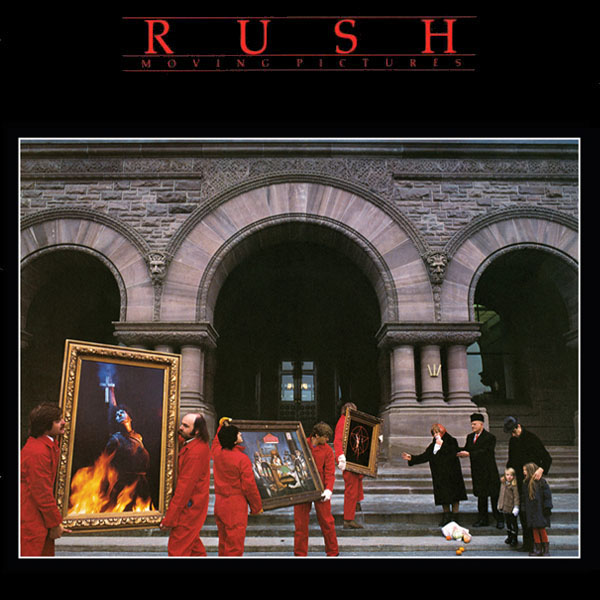
Hugh Syme, Rush's longtime art director, compares album cover design to songwriting: Some concepts take ages to work out, and others arrive instantly.
"I'm always jealous when I hear [my favorite] songwriters - Donald Fagen or Joni Mitchell or Peter Gabriel or Don Henley - say, 'I wrote that song between coffee and lunch,'" he tells UCR. "What an accomplishment. But I also hear they herniate over other songs, taking weeks or months to bring them into focus."
His vision for the prog-rock trio's eighth LP, 1981's Moving Pictures, crystalized as soon as he heard the title from drummer-lyricist Neil Peart - conjuring visual puns. "I Immediately saw people moving pictures," he says.
Not that Rush were immediately onboard. "The band didn't get it at first," Syme says. "I said to Neil, 'We've gotta have some people moving pictures.' It was another one of those 'What?!' kind of moments. It took a little more description from me to fill in the details."
It's a layered joke: The cover shows a crew of workers physically moving pictures (paintings of dogs playing poker, the "Starman" character from 2112 and a burning Joan of Arc) and a group of people being moved to tears by these pictures.
Syme originally pictured a grandiose backdrop, like a "truly historic place in Europe," for the photo. Instead, the crew kept things local: "Budgets being what they were at that time, we ended up using the Ontario Legislature in Toronto's Queen's Park as a nice nod" to Rush's hometown. "Pink Floyd used the Battersea Power Station on their Animals cover, so why not?"
"Unwittingly, there were three arches and three pillars," he adds. "That also became a play on the Rush triumvirate, the trio of elements."
Rush covers often feature Easter eggs and in-jokes, using friends and acquaintances multiple times across their catalog. One participant was Syme's pal Bobby King, who previously played the suit-clad "[René] Magritte character" on Hemispheres, the "willing bare-assed character for the Starman [on 2112]" and the man in the stage wings on Exit...Stage Left. For Moving Pictures, he shows up as "the prime mover - no pun intended." ("I made good use of his good will," the art director adds, "and his cheap modeling fees."
Photographer Deborah Samuel, who shot the cover, pulled double duty - also appearing as Joan of Arc. And that painting was itself a reference to the Moving Pictures song "Witch Hunt," on which Syme added synthesizer.
"I thought Joan of Arc was definitely the iconic moment in history to play on," he says. "We couldn't find the right witch, so half a bottle of 18-year-old Macallan Scotch, some Ronson lighter fluid, some burlap and a wooden post later, I shot Deborah as the cameo witch. Necessity is the mother..."
The photo became a "little more Fellini-esque" because of the overcast day after he added "a group of Bolshevik people" to play the distraught characters in the right part of the frame.
"They were the parents of a hairdresser at Vidal Sassoon," Syme says. "Her parents were Russian, and her father owned one of those iconic bearskin hats. They arrived on set, and they just looked the part. It was fantastic that they just fell into step. I said, 'Your groceries have just fallen; your art museum has been pillaged; and you're feeling very forlorn.' When I mentioned, 'Just look as somber and woeful as possible,' [the mother] immediately took out a handkerchief and started into a mock weep. I thought, 'This woman's great.'"
Why Rush Nixed Snagglepuss Nod on Exit...Stage Left Cover, October 29, 2020
Rush art director Hugh Syme wanted to playfully reference a famous cartoon on the cover of Exit...Stage Left, the prog-rock trio's 1981 live LP. He was eventually forced to ditch that idea - and while he wound up with an equally compelling image, his original vision would have further spotlighted the band's underrated playful side.
The character in question was Snagglepuss, the sophisticated, theater-obsessed, anthropomorphic beast who appeared in several Hanna-Barbera shows starting in the early '60s. The album title was a homage to his most famous catchphrase, and Syme pictured a visual that (subtly) matched those words.
"I wanted to do nothing more than just a solid black cover with a pink tail - and probably the back of Snagglepuss' ankle," he tells UCR. "A complete nod to Snagglepuss: I just wanted to keep it real pop-art - graphic and simple."
But that dream died after the animation studio got involved. "We got in touch with Hanna-Barbera, who owned the rights," he adds. "But apparently the ask on that was prohibitive, so that was quickly nixed. I even asked, 'Can I at least put a pink tail on there somewhere?' No one's gonna know.' There were too many legal beagles on that one saying, 'No, better not.'" After that plan fell apart, Syme pivoted to another lighthearted idea: reviving visuals from Rush's own visual universe.
All eight previous studio albums are represented in some fashion. The front image shows Paula Turnbull, the woman from the Permanent Waves cover, peering out from behind a stage curtain to a live audience; she stands next to Syme's friend Bobby King, reprising his role as the suit-clad man from the Hemispheres cover; and above him flies an owl (a reference to Fly by Night). The fun continues on the back, with various tips of the cap to Rush, Caress of Steel, 2112, A Farewell to Kings and Moving Pictures.
"We resolved to make the artwork a nod to several of the preceding albums," Syme says. "I featured those key elements from those albums to make their own cameos in the wings of the stage - we even brought back the actual personnel from those covers."
Why Rush’s Minimalist Signals Cover Earned an ‘Irate’ Reaction, November 14, 2020
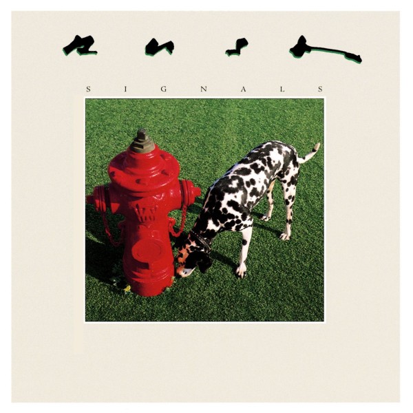
The cover of Rush's ninth LP, Signals, was so uncharacteristically simple and dry, the band's manager was apparently puzzled to the point of anger.
"When I told [him] my concept for Signals, he didn't seem to appreciate it," the prog-rock trio's longtime art director, Hugh Syme, tells us. "It was one of the few times he was quite irate and stormed out of my studio, saying, 'I don't know what the fuck this has to do with rock 'n' roll.'"
The image - a Dalmatian sniffing the base of a bright red fire hydrant on a freshly cut lawn - wasn't intended to enrage. Instead, it sprung from the idea of "leaving your mark, determining whether or not you were the first to occupy a particular territory...a signal to other interloping canines in the subdivision."
But before reaching the final cover, Syme explored a variety of visual concepts - both low- and high-brow varieties.
"That was a tough one," he recalls of the process. "We actually spent quite a few weeks trying to track that one down. We played around with the RKO graphics at the beginning of those 1930s and '40s films with the beautiful transmission towers. We had some iconic but cartoonistic graphics in consideration. I was even looking at the idea of those kids' toys [a joy buzzer] where you shake hands with someone and it feels like an electric shock but it's just a vibration. We were going to have a close-up of that. We played around with Tesla/Marconi and certainly morse code."
Syme had a lightbulb moment after "Subdivisions" emerged as a candidate for the album's lead single. Building on the song's clever geographical themes, he and the band discussed creating a blueprint for a fictitious place: One example was the Warren Cromartie Secondary School - using the name of a baseball player for the Montreal Expos - which appears on the back cover.
That idea "organically" bled into the front cover, subtly enhanced by its vibrant colors. "This was all before David Lynch and Twin Peaks, but those perfect green lawns and creepy, cookie-cutter neighborhoods came to mind," Syme says. "I thought, 'A graphic green lawn with a Toronto red fire hydrant' - and then the idea of a Dalmatian sniffing the base. It all just felt right."
Rush's manager may not have been immediately onboard, but Syme wound up validated in the end - earning a co-sign from some of his visual heroes.
"[Hipgnosis'] Storm Thorgerson co-edited a series of books under the title The Ultimate Album Cover Album. There were two volumes at the time. [My work] was in them, but I didn't have a full page like many of the people I admired. I thought, 'Maybe some day.' On the third publication, I leafed through the book and, sure enough, Signals had its own full page. I felt really gratified, and it was fun to give that to [Rush's manager] as his Christmas gift that year with a Post-It on that page."
"It wasn't an 'I told you so' moment," he says, "so much as a 'who'd a thunk?' moment."
How Drinking Brandy Inspired Rush’s Grace Under Pressure Cover, December 6, 2020
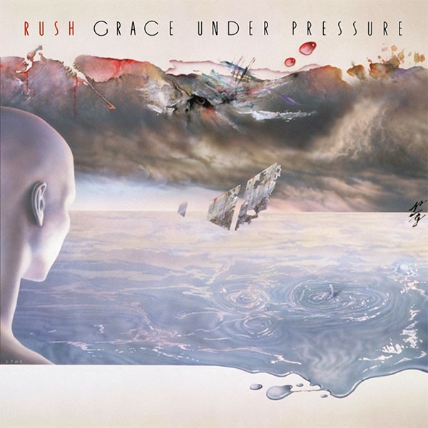
When Hugh Syme learned the title of Rush's 10th LP, 1984's Grace Under Pressure, he immediately translated those words into colors.
That simple starting point eventually spawned one of the artist's most distinctive paintings, which pivoted from his signature photo-composite work.
Eating dinner and drinking brandy at the Toronto home of drummer-lyricist Neil Peart in October 1983, Syme fired off a simple visual concept that built on his aesthetic of "continuing minimalism."
"I really love the simplicity of albums like Discipline by King Crimson," the prog-rock trio's art director tells UCR. "[And] the early suggestions were influenced by my then admiration and study of pianist Keith Jarrett and an appreciation of those beautifully minimal jazz album covers from his ECM record releases with Manfred Eicher from Munich. I suggested I do a painting (in the minimal style of Mark Rothko) where we bisect the page."
"When I heard about [the title], I said, 'Why don't we have 'grace' as a relaxing cream tone under the 'pressure' of the more ominous grey?'" he continued. "It was literally just split in half - a little like No Line on the Horizon became for U2. It was going to be hugely graphic. We both thought, 'That's it!'"
But as they "drank more and more glasses of [Peart's] obscenely rare Armagnac after dinner," Syme began sketching more "figurative" ideas.
"We could have someone looking into a more elemental kind of sky - the pressure of weather and the grace of water," the artist suggested, describing his concept for the stormy, slightly sci-fi-looking image. "It was all starting to sound right to Neil, and he said, 'That sounds great too.' It ended up being something I wanted to paint - and almost had to paint to pull off."
Syme emphasized the symbolic duality with the "P/G fraction" lettering tucked on the right side of the image. "I would render dozens of versions to create my signature 'urgent' calligraphic India ink letter forms that Geddy [Lee] once called a 'murderous scrawl,'" he says. "And that would lay on my studio floor until the ink was dry."
The art director hasn't painted for many album sleeves - though he did use that medium for the cover of their next LP, 1985's Power Windows.
"It also was one of the rare occasions [of painting for a cover]," he says, "even though I enjoy painting and continue to. It's just not often enough because a lot of my technique delved more and more into the photo-composite realm of improbable reality."
Rush’s Power Windows: How Adding TVs Perfected Album Cover, October 29, 2020
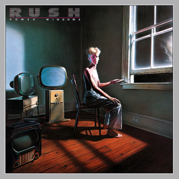
Like many Rush album covers, Power Windows started with a pun and ended with a compromise.
Hugh Syme, the prog-rock trio's art director since 1975, began with a play on the titular phrase of their 11th album. His evocative painting, based on a reference photos by Dimo Safari, shows a blonde, shirtless, disoriented young man trying to control his window with a remote control. Everyone in camp Rush liked his first version of the cover - but one element, he tells UCR, "came back to haunt [him]."
"I finished the painting with [the character] in an empty room, and I loved its solitude and simplicity," he recalls. "Everybody liked it. Geddy [Lee] came up for air, which he often did at the 11th hour, because he was so consumed with Alex [Lifeson] on the music side of things. And he said, 'This is great. I love it. Where are my TVs?'"
At Lee's insistence, Syme revised the artwork to include a trio of televisions - adding another veneer of visual meaning. (He admits, with a laugh, "I remember feeling somewhere between annoyed and challenged when I heard this was a client requirement.")
"We only alluded to the Marshall McLuhan aspect of the TVs when we started talking about what was then our power window," he notes. "[Today], it's a handheld cell phone or tablet or laptop or whatever. [Then] our power window to the world was a TV. It was controlling everything from our taste to our concept of what was news. So the TV became important, but the pun of a lone character with the misguided notion that he could control the room with his remote control was more important to me than the TVs."
Tasked with finding the perfect televisions, Syme scoped out some vintage "collectors item" Philco sets at a Toronto store called the Red Indian. "They were very generous to let me photograph those for reference," he says. "I had to go back and re-gesso the canvas carefully in the area where I was gonna feature these TVs because they were not in the original photo."
Even though the bassist's creative request may have caused some initial frustration, Syme is grateful Lee made the suggestion - it's a richer, deeper cover as a result.
"To this day, I credit Geddy with the wisdom of insisting on those [TVs] because it really does help the painting," he says. "It gives it another layer of presence and meaning."
Rush’s Understated Hold Your Fire Cover Hides a Big Surprise, December 19, 2020
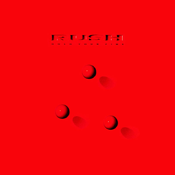
Hold Your Fire is one of Rush's most understated covers: three spheres in a triangular pattern, set against a red backdrop. Ironically, art director Hugh Syme saved his more intricate, eye-catching design for the inner package.
"To have the cover that sparse, with [a more intricate interior] - I liken it to the liquid center on a candy," he tells UCR. "When you finally bite through it, you encounter the unexpected."
The gatefold artwork is among the most famous from his vast portfolio with the prog-rock trio. On a rainy street, amid fire hydrants, stray cats and sewer grates, a disheveled, cigar-chomping businessman juggles three flaming orbs, which form roughly the same pattern as those on the cover.
And in the pre-Photoshop era, creating that detailed scene was an artistic challenge - full of tactile maneuvering and imaginative workarounds. He constructed the backdrop as a five-foot-wide miniature set, photographing it in the studio using "mini-mole lights," similar to theater lighting.
"That was a fun shoot," Syme recalls. "Building and painting that set was about a two-week process. We wanted the streets wet, and we quickly found out that, because we had made the asphalt out of heavy grit sandpaper - glued and taped to a Foamcore substrate, all of which was very porous and absorbent - the moment you started spraying it with water, it started curling up. We had to clamp the streets down. We reverted to mineral spirits, which stayed wet-looking for about 15 seconds under the hot light, so you had to keep spraying down the set to keep it looking recently rained-on."
To create the "airborne flaming orbs," Syme lathered some volleyballs with rubber cement and photographed them outside at night.
"I later composited those together," he says. "It was a process called emulsion stripping, where you take high-powered [binocular-type glasses] to better see where to cut the emulsion layer, and they actually float the color emulsion layer off the top of the clear acetate substrate. It's not as fragile as you might expect. It's not like it falls apart. But it's very flimsy because it's wet. They put one layer on top of the other, and you have to cut through the fire ball and through the background (at the same time). You pull a piece of background out and lay the fire ball into the background - it's all very analog."
Syme originally cast Dennis Hopper - who'd recently co-starred as the deranged villain Frank Booth in David Lynch's 1986 thriller, Blue Velvet - as the juggler character. But after the actor's "schedule caved in and ambushed our aspirations," they recruited Stanley Brock.
"Glenn Wexler, who photographed the elements for this image, had access to Stanley through a casting agent he was familiar with," Syme says. "He came in and was a real character. He suited the role perfectly. I always regretted the fact that it wasn't Dennis, but that's OK."
Despite the "arduous hard work" of assembling that scene, he still wanted to take a more subtle approach to the cover - and in a theme that ran throughout his decades-long Rush tenure, the higher-ups apparently weren't happy with that vision.
"To the dismay of management," Syme says, "I opted to do something really minimal and graphic on the cover" - choosing a "shape that would permeate through the marketing and the merchandising: the three spheres."
In this case, surprise was essential to the visual experience. "That gatefold," he adds, "was intentionally meant to reveal a more elaborate image."
How Rush Wrangled Rabbits for Quirky Presto Cover, November 21, 2020
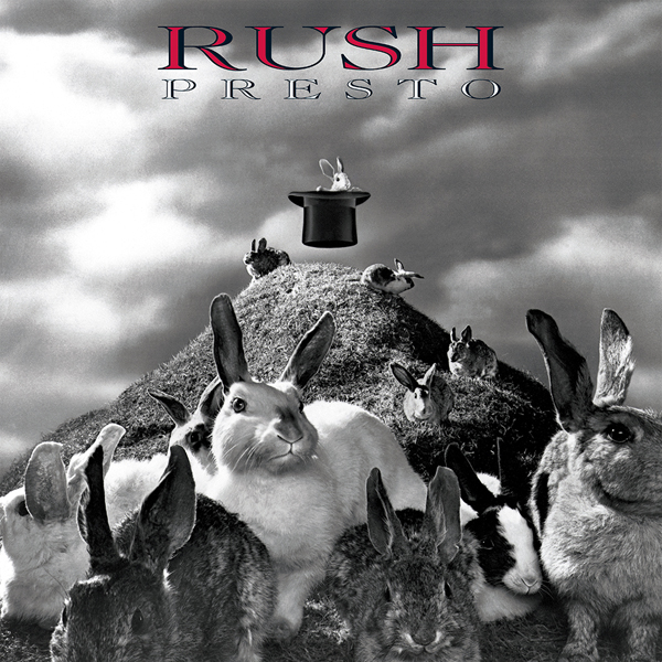
Many of Rush's album covers were silly: the workers literally moving pictures on Moving Pictures, the Dalmatian lingering near the fire hydrant on Signals. But the prog-rock trio reached another level of playfulness with their 13th LP, 1989's Presto.
The humor of the front image - a group of rabbits on a hillside, with one bunny magically levitating in a top hat - is so obvious that drummer Neil Peart seemingly cringed when explaining it to a curious fan.
"No one ever laughs at the explanation of a joke," he wrote in the band's Backstage Club Newsletter. "Anyway, the idea was that these bunnies are taking matters into their own, um ... paws, and making themselves appear from the hat, and flying around in it. Go on - laugh your head off!"
As Hugh Syme, the band's longtime art director, tells UCR, that's the full extent of the title-art connection. "The fact that magicians pull rabbits out of their hats - that's the only allusion to 'presto,'" he says. "That and the number of rabbits on the hillside adding to the prolific nature of that hat."
The concept may have been hilariously simple, but the creative process was a bit more complicated.
"Do you remember the days of backdrops? [For example, in] The Andy Griffith Show, they'd do a set for the sheriff's office, and when you open the door up, what appeared to be across the street in Mayberry was painted," Syme explains. "The whole sky backdrop I found over at MGM Studios. They had these canvases that actually rolled through a slot in the floor so you could do a painting that was 100-some-feet wide by 60-feet tall.
"It was a massive loom, and you could roll the canvas to work at eye level," he continues. "If you're doing leaves on a tree, you're up in the tree. If you roll it up for the long shot, it could serve as a background. They had a huge number of beautiful storm skies available, and I rented that from them so it could be in-camera. I got some grass mats and built this huge hill out of hay bales."
The trickiest part came when he introduces the rabbits themselves. A couple were taxidermic, but the rest were live - and the studio space, naturally, got messy.
"We brought in the rabbits so they could spend the next four hours pissing and shitting all over [photographer] John Scarpati's gratefully concrete studio floor," Syme says. "They aren't models - we knew it was happening and would have to deal with it later. It was a fun day."
Rush’s Roll the Bones: How Theme of ‘Chance’ Inspired Cover, January 8, 2021
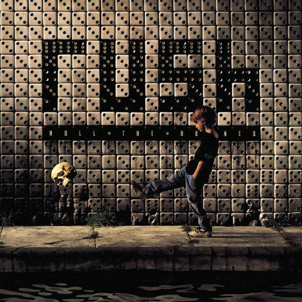
Neil Peart's lyrics on Roll the Bones are loosely themed around the idea of "chance," and art director Hugh Syme expanded on that broad concept with his cover for Rush's 1991 LP.
His logical starting point was a game of chance: dice. But he twisted the album's titular phrase into a more unsettling, if bleakly humorous, image.
"'Bones' was slang for dice because dice are made of ivory," he tells UCR. "I've always been fascinated with the juxtaposition of youthful innocence and inevitable mortality, like having a kid playing kick the can - but with a human skull."
The cover shows that young boy, leg extended, standing mere feet from the skull. He's walking on a platform next to water, positioned in front of a wall of dice that spells out "rush" in black pieces. "Knowing I wanted dice for the tiled subway wall behind the boy, I decided to build a subway platform with water," Syme says. "These things just occur as you proceed through a project."
As usual, the art director got his hands dirty to create the image, building "a big frame" that measured 20' x 16'. "It came to a point where the camera sat almost at water level," he recalls. "We sandbagged this big 2 x 12 board frame and had the carpenters come in and make it so we could drape very carefully fused black vinyl over the whole thing. [Photographer] John Scarpati's studio was formerly a brewery and distillery, so all the floors were originally structurally sound enough to roll huge barrels of ale.
"We built the subway platform out of 2 x 4s," he continues. "I used a water-proof Foamcore [Sintra], and I painted that and texturized it to look like a concrete walkway. The background wall was a miniature that I created out of dice, which I painted and distressed [then] introduced into the scene later. The weeds and all the detail were brought in so they could be photographed in-camera at the time the boy walked across the stage. Of course, we wouldn't rely on the boy to successfully repeatedly kick the skull, so the skull was shot as a separate element and stripped in later. This all took place right on the threshold of Photoshop's genesis, so that was all done digitally."
In a January 1994 installment of Rush's Backstage Club Newsletter, Peart wrote that the cover "reflects a style of 17th-century Dutch painting called vanitas, in which symbols, such as the skull (and also candles, books, flowers, playing cards, etc.), were used to remind the good Netherlanders of life's brevity, and the ultimate transience of all material things and sensual pleasures."
But Syme denies intentionally channeling any such style.
"I don't see any kind of 'Vermeiren Dutch Master' attributes in that piece," he says. "The edge lighting on the boy looks like that, but it certainly wasn't my intent. Maybe it was an afterthought, an observation - by some - in hindsight."
How Rush Embraced a Nuts-and-Bolts Style for Counterparts Cover, October 19, 2020
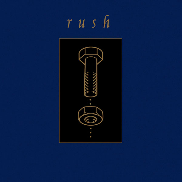
A decaying puppet king in front of a demolished house, a nude ballet dancer on a brain, a disoriented boy trying to control his window with a remote control - Hugh Syme brought grand conceptual designs to his early work with prog-rock trio Rush. By contrast, his cover for 1993's Counterparts was almost punk in its shocking minimalism.
"That was a bravely, almost impudently simplistic cover," Syme tells UCR. "In the wake of so many more elaborate Rush covers, I thought, 'I want to keep things migrating into whatever direction they should for a particular project.' That's where the band and I shared the credo that we always endeavor to 'deviate' from any expected norms."
The original concept was - like many Rush designs, including the overtly literal Moving Pictures - based on a visual pun. "The cover for Counterparts almost became an exploded mechanical diagram of a sink and a tap and a drain trap," Syme says. "It was going be a literal illustration of counter parts - even more silly."
But the art director's vision for the project shifted after getting in the weeds with Rush drummer and lyricist Neil Peart.
"We passed on [the counter parts] because we started discovering these dualities: yin and yang, salt and pepper, tortoise and hare, ribbed and lubricated, slap and tickle; lock, stock and barrel," he says. "We had a lot of fun - Neil and I spent about six or eight weeks calling each other, saying, 'I've got three more. I've got two more.' We built a whole archive - it became what I eventually illustrated as 'The Prayer.' Inside the package there was this big, folded poster that showed all these visuals. We couldn't decide on any one of them, so we said, 'Let's just do them all.'"
For the front cover, Syme wanted one of these images to reflect the entire "counterparts" concept. He landed on a nut and bolt.
"I just liked the diagram, and I liked how cheeky it was in its simplicity," he says. "I don't recall how it became the distillation of all those options. Any of those elements could have become the cover. Come to think of it now, I wasn't thinking remotely sexual with the bolt going into the hole or the proverbial train and tunnel, but hindsight says that's a fun aside. I was just glad it wasn't the sink and faucets and drain trap."
It was a drastic change from the lavish designs of past Rush LPs, but it reflected Syme's desire to evolve. "Even Neil resisted that simplicity at first," he recalls. "He thought, 'I love it, but really? Should we?' And I thought, 'Yes.'"
How a Stone Sculpture Guided Rush’s Test for Echo Cover Art, December 29, 2020
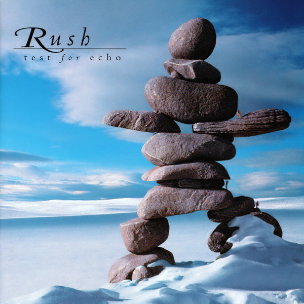
"Test for Echo is all about finding your way," says Hugh Syme, Rush's longtime art director, of the prog-rock band's 1996 LP.
And through the inspiration of drummer and lyricist Neil Peart, he arrived at a wise, wintry album cover that symbolized that theme.
"Neil did a lot of traveling, and I knew he would venture up into the Northwest Territories [of Canada] and less-travelled destinations like that," Syme tells UCR. "You would see inukshuks, those stone sculptures - some of them looked very crude. Throughout the Arctic, [they] were erected as beacons in this treeless and featureless Great White North, where you could easily get lost without some kind of landmark."
During one of Peart's famous motorcycle trips, he spotted a particularly striking inukshuk and sent the image to Syme in postcard form.
"I really loved [it], but of course, it was a low-res postcard," the art director says. "Despite extensive research, I couldn't find a better inukshuk than that one. I did a lot of research on inukshuks, and a lot of them were flat, shelf-like stones, and they were quite boxy-looking. They didn't have nearly the body language that this one did. This one [on the cover] had a really animated feel to it."
From there, "necessity became the mother of invention," as Syme carved a replica of the inukshuk as a 22-inch-tall sculpture.
"It's amazing what you can do with florist's foam, a little bit of plaster of paris and paint," he says. "Carving that at [that height] allowed me a lot of latitude in the photo sessions that followed. I could shoot our inukshuk from different angles."
In the studio, Syme used creative tricks to flesh out the image.
"I would later place some baking soda, and with canned air I would blow it and make it drift up onto the foot of the inukshuk to make it look like drifting snow," he says. "[In addition to] that in-studio photo and the arctic scene I used as the background, the sky was from yet another photo because I couldn't find anything I liked all in one frame of reference. It was all digital, except for the analog creation of the inukshuk."
Syme still owns the miniature inukshuk, and he still thinks about the deeper meaning of the creation - both the original and his own.
"'Inukshuk' is Inuit for 'in the likeness or man' or 'doll,'" he says. "It's kind of an interchangeable word. I find that fascinating."
How a Real-Life Comet Inspired Rush’s Vapor Trails Cover, December 28, 2020
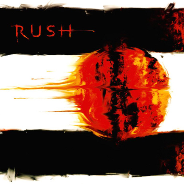
Like Rush's Vapor Trails, the story of its fiery cover art involves tragedy, emotional healing and a bit of magic.
The 2002 album followed the prog-rock trio's five-year hiatus, a period of immense grief for Neil Peart: His daughter Selena was killed in August 1997 at age 19 following a car accident; 10 months later, his common-law wife of 23 years, Jacqueline Taylor, died after battling terminal cancer.
The drummer and lyricist temporarily retired from the band, logging roughly 55,000 miles on his motorcycle as he attempted to process unthinkable pain. (That soul-searching eventually inspired his 2002 book, Ghost Rider: Travels of the Healing Road.)
Over time, Peart was able to move forward both personally (remarrying in 2000) and musically (rejoining Rush the following year). And he inevitably brought some darker, heavier lyrical themes to the band's 17th LP.
"Fans know that's when the band resumed work after Neil's long, dark journey," Rush art director Hugh Syme tells UCR. "And he was talking about vapor trails, about how our lives, like comets, sparkle and fade. I remember hearing that line and thinking, 'Well, I know what this album's about.'"
Peart had also started brainstorming reference points for visual concepts, showing Syme "all kinds of NASA photographs - all beautiful renderings of comets going through the sky."
Then came the magic - or at least a very bizarre coincidence that Peart describes as a "Twilight Zone moment" in his life.
"During my the week when I was working on the initial stages of that album [art], I was at my studio, which at the time was in Indiana across a small lake we had on our property," he says.
"I went outside to get some air. I looked up and honestly it was the most surreal [sight] - I've seen shooting stars that happen in the blink of an eye, but this one cruised across the sky. It must have taken about 10 full minutes to make its way from overhead to the far horizon before going out of sight. You felt like you could touch it - it was so close to the Earth."
He described the object as a "big ball of fire" with a "long tail" that sparkled. "It had a big head at one end and a little head at the other end," he recalls. "It appeared to be a big galactic spermatozoa. [Laughs] It was really slow-moving, made no noise but really felt close to the Earth - to the point when I went to the horizon, I was bracing myself for a massive impact. Anything that big and that visible from Earth had to have been a sizable mass of material."
After that bizarre event, Syme re-approached the cover with a new perspective. "I remember telling Neil, 'I've never seen anything quite like this. I think we don't want to be quite so literal [about this]. We need to be more gestural, more urgent and passionate,'" he says. "I didn't know quite where I was going with that, except to say I didn't like the relatively dry textbook feel of NASA photography. I said, 'We can do better than that. Plus, [Supertramp's] Crime of the Century owns outer space, so let's not go there again."
Syme did a "quick rendering" of his impressions with a paintbrush and finger painting on a square, 18-inch board. This was only intended as a "sample painting" to show Peart what he had in mind. But the drummer's response was more enthusiastic than expected. "I remember saying to Neil, 'Something like this,' to which Neil responded, 'No, no, that's it,'" he says. "And I said, 'No, no, I'll do it right.' He said, 'That is right!'"
The Vapor Trails cover was an example of Peart using his intuition and playing "creative director," Syme says.
"A lot of musicians will say, 'I did that in the basement on ProTools, but I can do it better' or 'Let's do that take just one more time,' and producers will say, 'We can try, but that was really good,'" Syme says. "Bands will do 15 more takes and then still return to the first take. A lot of musicians and artists stubbornly persist and think they can improve on something.
"I suppose I wasn't seeing the forest for the trees, while Neil clearly was," he notes. "He insisted that be the cover. He also introduced me to the adage that 'perfection is the enemy of good.'"
How Rush Channeled Old Board Game for Snakes and Arrows Cover, January 4, 2021
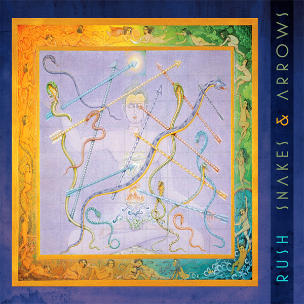
Hugh Syme and Neil Peart were close, like-minded collaborators by the mid-'00s, having conceptualized three decades' worth of Rush album covers.
They almost always saw eye-to-eye creatively. One exception - at least at first - was 2007's Snakes & Arrows, which incorporated a Harish Johari painting based on an ancient, karmic Hindu board game.
The visual arose directly from the album's title, part of Peart's lyrics for "Armor and Sword." Ruminating on how children inherit - rather than choose - religious faith, the drummer combined the Hamlet phrase "slings and arrows" with the children's game "Snakes and Ladders," arriving at a word combination that felt fittingly familiar yet strange.
While researching to make sure the title hadn't been used by another band, Peart learned about the 2,000-year-old "Leela, the Game of Self-Knowledge," otherwise called "The Game of Snakes and Arrows." ("The Leela player rolls a single die, said to be affected by his or her karma and moves around the board," Peart wrote in the album's corresponding tour book. "Each square on the grid represents a stage of consciousness or existence, and the player is raised to higher levels by arrows, and brought low by snakes.")
When Peart discovered Johari's painting, he was struck by the visual-lyrical "serendipity" - and after earning approval from bandmates Geddy Lee and Alex Lifeson, he decided to make it the cover. Syme, who always handcrafted the prog-rock trio's artwork, was initially less enthused - though not because of the piece itself, which he describes as "lovely."
"It was one of the few times I thought, 'Now the world has access to Google, even Neil Peart,'" he tells UCR. "So I remember saying, 'I see what you have in mind, so leave it with me and I'll see what I come up with.' He said, 'No, I want that for the cover.' It was the first time I admittedly hung up, with a bit of a harrumph, still knowing I would be designing the entire package."
Syme recalls seeing internet critiques about the cover choice - and after doing his due diligence by passing them along, he earned a "very Neil" response.
"I remember - not as a complaining, territorial art director but as someone who felt, 'I wouldn't be doing my job if I didn't mention something to the band' - apparently there was some viral outcry when somebody leaked that board game image," he says. "People were saying, 'Why would the band use an existing game board I can buy on Amazon? This is crazy.' There was even some chatter [of] 'Is Hugh going the way of [former Rush producer] Terry Brown?' I remember saying, 'I better let Neil know these comments were being posted online.' Neil's response to me was ... 'When any of those people have their own band, they can make their own decisions.' Basically, 'Fuck off.'"
But Syme wasn't boxed out from the design process.
"I took liberties and created my own cover for the CD book cover," he says. "I had other platforms within the package to render my own interpretation of Snakes & Arrows. So I did. And Neil jokingly said, 'I see you claimed some real estate for yourself within the package.' Which is okay. But it's one of the few times he just liked something that he had unearthed [and decided to use it]."
He adds: "It became what it was. I understand it was a successful album. But we never repeated a cover with 'found art' again."
Why Rush Went ‘Minimal’ for Cover of Final LP, Clockwork Angels, January 11, 2021
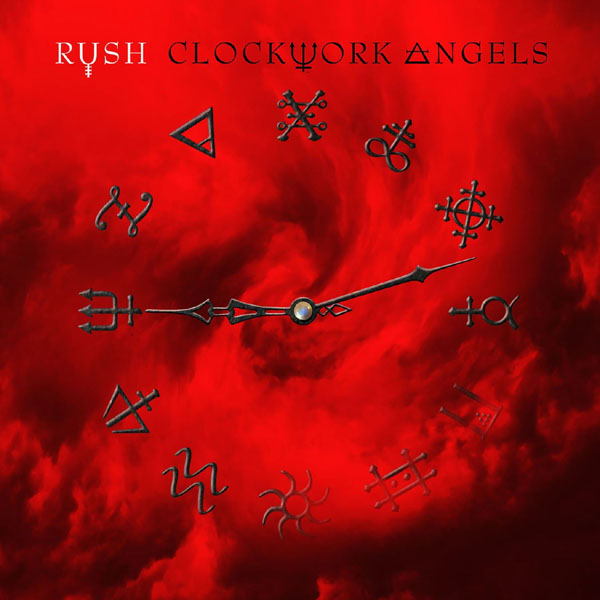
Art director Hugh Syme considers Rush's 2012 LP, Clockwork Angels, the band's "opus," particularly for Neil Peart. And given the lengthier undertaking behind their final record, he earned a clear "window" into the drummer and lyricist's "working process and expectations."
"There was a lot of good fortune in our timing on that," he tells UCR. "They were having a good time [on the 2010-11 Time Machine tour], which was rare because Neil didn't normally like to tour. ... They decided to do a European leg, I believe. They were going to leak two songs ['Caravan' and 'BU2B'] from the forthcoming album [as] sort of a 'work-in-progress' - something they'd never done before. And the reason was that they didn't have the album anywhere near ready. They had those two songs in the can and played them live."
Previewing the project made sense commercially, generating fan hype for what became their first album since 2007's Snakes & Arrows. The slower pace allowed Peart to spend more time refining his lyrics, which later spawned an entire sci-fi novel co-written with Kevin J. Anderson.
Syme also benefitted from that timeline, with more flexibility to brainstorm visual concepts - first with the "Caravan" and "BU2B" single covers, later for the full LP. "I was able to spend the better part of 18 to 20 months preparing the artwork for what was promising to be...an epic undertaking," he says.
"I knew from talking to Neil how important this one was to him because it was a book in development," he continues. "The story kept growing and growing! It was one of the first full epic albums they'd done since 2112 [in 1976]. And I could just hear in his tone how much he was invested in this." And Peart, as became more frequent on Rush's later albums, had a clear vision of what the cover might look like.
"He liked the idea of just the clock and those alchemic symbols," Syme says, describing the final product. "I said, 'They'll have a nice home in the package somewhere.' It was one of those [moments of], 'No, I want that on the cover.' I remember feeling a little compromised by that summary request. But it did work really well. It ended up being a clean, iconic, minimal cover."
That image, like the simple graphic on 1987's Hold Your Fire, is just a teaser for the more robust designs inside. "I think it coexisted nicely against what would eventually be revealed in my illustrations for the inner package," he notes. "The rationale I had adhered to on Hold Your Fire found its place in Rush history once again." Syme admits that, had he been "left to his own devices to do a cover for such an epic saga," he probably would have created something slightly more "picturesque" and "environmental."
But he's realized over time that the drummer's instincts were correct, as usual.
"The client," he says, "was right."