The Art of Rush
by Philip Wilding, PROG #125, November 2021
Over a period of 40 years, artist and illustrator Hugh Syme has been behind some of Rush's most iconic artwork. As his coffee table book, Art Of Rush: Serving A Life Sentence, is updated and reprinted, Prog quizzes him about the Starman, reimagining his art for the recent reissues and his long-lasting friendship with Neil Peart.
Hugh Syme is, not for the first time, lost in a reverie. We are, essentially, talking about the updated version of his 2015 book, Art Of Rush: Serving A Life Sentence. The latest edition comes complete with the work he's done for the anniversary reissues of 2112, A Farewell To Kings, Hemispheres, Permanent Waves and the forthcoming Moving Pictures. Or we were. Talk turns to the work he did on the latter-day revamp of 2112, but within minutes we're back in the 1970s and the initial meeting for the record and the matter of some accidental iconography.
"There was definitely a conversation," says Syme, off on a tangent, "where I was told the arc of that epic story about defiance and individualistic artists and someone who was determined to express himself, despite the autocratic red star, the so-called Federation. Those that demand freedom of expression and those who tried to quash that. When I heard it was a red star and an individual striving to escape the clutches of oppression, then the Starman was born, it was purely accidental that it became so iconic and would echo down the years.
"I remember saying to Bobby [King, a then-member of Syme's design team], ‘For the purity of the character clashing with the Federation, I don't think we need to have you in jeans and a T-shirt. Let's just make it as pure as a Greek sculpture, stripped down, let's get you naked.' And he just sort of looked at me, but he did it, never been remunerated for it either. So, apart from being a dear friend, he's also a cheap model."
You know Bobby King without knowing who Bobby King is. Riffle through your Rush albums and there's King again and again. Not only the model for the Starman (yes, that's King's butt), but he's the Magritte figure floating on the brain from Hemispheres – the model playing the Starman figure on that cover is a dancer from the Toronto ballet. King is hefting paintings on Moving Pictures, too, and you can find him reprising that role on the live Exit Stage Left album.
King, like Rush, has been a constant in Syme's life. If readers missed his book the first time around, this latest revamp is a wonderfully detailed pictorial history of his work and Rush's most enduring covers. Sketch ideas, early artwork, testimonials and the great and good putting the case for their favourite band sleeve. For the record: this writer was asked to contribute to the first edition and couldn't decide between Presto and Grace Under Pressure, so chose both. I even got the Manic Street Preachers involved, and as memory serves, Nicky Wire opted for the cartoonish figure slouched across the cover of A Farewell To Kings.
"The thing with Farewell..., with a lot of the albums, I suppose," says Syme, "was the budget always dictated what we could do. In a perfect world, you know, I'd have gone to Lindisfarne, or somewhere like that, to photograph the ruins for the cover of A Farewell To Kings. As opposed to some demolition site in Buffalo we did use, which was across the US border. Of course, it still worked out. You still get the idea.
"The same thing happened with Moving Pictures. I wanted to go to a truly classical museum in Europe somewhere and it was really a fortuitous and dumb luck situation that the Queen's Park building [the Ontario Legislative Building] in Toronto actually had three arches. So, it was still appropriately neoclassical. It serves the purpose well, and then I realised, you know, look at Battersea Power Station for Pink Floyd's Animals cover, it's okay to use familiar landmarks."
Syme brought the Kings... cover up to date digitally, no day trip to Buffalo with a wooden throne and puppet king in tow this time. The new illustrations for Xanadu include a glass domed city set in a snowy landscape, our hero a seemingly impossible distance away. The title track depicting a discarded crown being picked apart by a crow's cruel beak.
"I enjoyed creating that cover," says Syme. "There was a slight nod to the fact that there had been retirements, so the thrones were empty now, just to say the band weren't there anymore. And then highlighting their specific interests: the set of golf clubs standing in the window waiting for Al to play a round, Neil's love of reading in those stacks of books, the open bottle of red, drinking obscenely expensive wine. I think everything's accounted for in that image."
In the pre-internet age (with Rush almost constantly on tour), Syme was pretty much left to his own devices when it came to capturing the essential elements of the band's albums. When Prog asks him how he pitched the idea of a naked man floating on a giant brain through a barren landscape for Hemispheres, there's a bark of laughter.
"Oh, there was never any brief, as such, we didn't have what you'd call pitch meetings," says Syme. "In those early albums, particularly, that was always the case, no brief. I would usually receive the lyrics from Neil, these lovely handwritten pages – they're dearly guarded to this day – and the reasoning behind that was because the band often hadn't even written any music until after seeing Neil's lyrics. To be honest, my favourite starting point with any Rush project was always the evocative album titles.
"The Hemispheres image was my own. It was developed after Neil and I discussed the nature and behaviour of the left and right, the Dionysian/Apollonian hemispheres of the brain. I remember the Department of Anatomy at the Toronto University School of Medicine were kind enough to loan me someone's brain to photograph - I couldn't tell you whose brain it was."
It's hard to choose between the work Syme's done for Hemispheres and the revamped Moving Pictures. The former, if readers haven't seen it, renders the brain as a museum piece, being thoughtfully eyed by the dog from the Signals cover, and has three brains in determined formation floating across the Arizona sky. You can't say Syme's not having fun reimagining some of his most enduring work.
"I got to go back 40 years with fresh eyes," says Syme, "to not only familiarise myself with those works that I peripherally know, or had never really properly read, and delve into Neil's thoughts and lyrics, and see it all anew. I also could bring my new skill set that was 40 years hence, you know, so it was a great opportunity, and the selfish side of me was able to say, 'What would I do today for these titles?' And so, I got to bring a new sensibility to all of that.
"I remember the original Hemispheres as a learning experience, put it that way. Most art is and should be. But, from a time and effort standpoint, I'd say the painting I created for Power Windows was considerably more demanding and involved. Updating these albums has enabled me to look back and review my early techniques, I guess that must be very much like the band listening to early performances, too, or living with those billowing blouses and handlebar moustache photos that stare out at you every time you pick up a copy of 2112!"
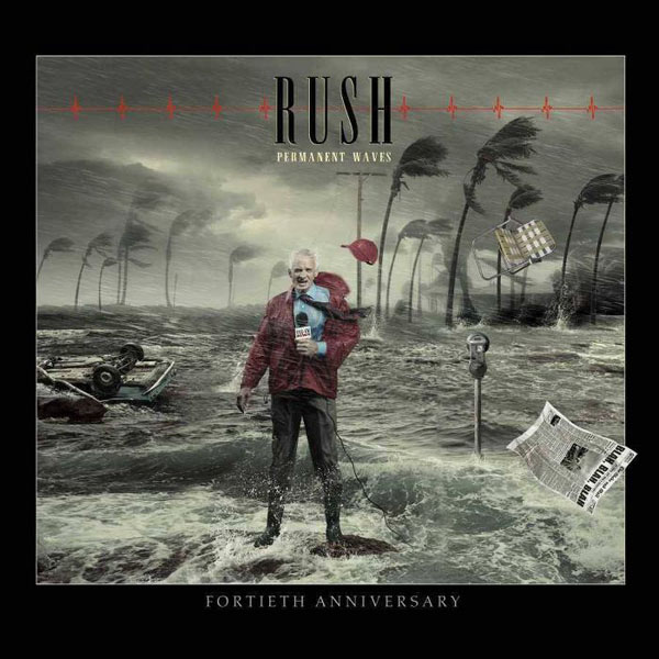
For the anniversary edition of Permanent Waves, artwork aside, the extra live disc from that tour is dizzying. Syme took the initial storm scene – a blustery Galveston Seawall in Texas during 1961's Hurricane Carla – upgraded it to a typhoon and transplanted a poor news reporter into the eye of the storm. No one can say he doesn't extract amusement with these things, but is there a more telling slant to those images, is the perilous state of the globe being reflected in PW's world at 40?
"I don't think it was an intentional nod at the time," says Syme. "But we're all at the mercy of our angels and demons and what comes through in our art. The world has always been in thrall to typhoons and monsoons, but there's definitely an escalation – the Philippines has seen more cataclysmic weather recorded this year than ever before. And now we have these forest fires that will never go out. I mean, the world is always in a state of flux, I just don't think we're helping the natural process in the way we consume as a people. So, even though I didn't mean to reflect that with the redrafted cover, in hindsight, it's not lost on me that Permanent Waves at 40 does kind of refer to that."
Talk, naturally, turns to Neil Peart, Syme's longstanding creative partner and friend. No one can deny the added poignancy of the Rush catalogue being revisited in a world where we no longer have Rush and we've lost Neil. There are two images that stay with the viewer long after they've lingered over the newly minted artwork for Moving Pictures: the illustration for Tom Sawyer and the foreboding sky that accompanies the Red Barchetta, both heavily laced with a new-found nostalgia.
"For me, and I think probably because I was doing that artwork post Neil, I just felt that the sky over the car can't be bright blue anymore. It was an autumn day for me, the passing of the seasons, you know. And Tom Sawyer, if one were to ask me, what's my favourite work on Moving Pictures, I would say that's up there, it's more emotional, and there's a real poignancy to it. Those two birds sitting on the fence and there's a third and he's either arriving or leaving. I guess he's leaving.
"Bobby, Mr Starman, who was our friend, he wrote to me after Neil passed and said, "Don't be sad, he's gone, be happy he happened. When I read that line, it gave me not only a moment of insight into what really is true about the life of someone like Neil, but I also know that's how Neil would want it. The last time I saw him, we were out in California in his man cave, as he called it, where he kept his cars, and he was like a different Neil. I could tell that he was happy, you know. His daughter Olivia was in his life and things just felt right in his world. His mind was just so busy sometimes, even though he was a goof and really chimed with Alex and Geddy and their sense of humour, but he was in such a good place. I felt very happy to see him so happy."
Art Of Rush: Serving A Life Sentence is out now via IDW Publishing.
See www.hughsyme.com for more information.