Hugh Syme Talks About The Expanded and Updated "The Art of Rush: Serving A Life Sentence" And More
By Eric Hansen, 2112.net/PowerWindows, September 30, 2021
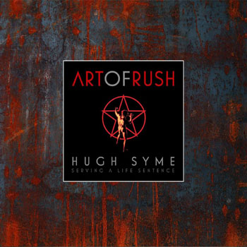
Originally published in 2015, The Art of Rush: Serving A Life Sentence, the newly expanded and updated coffee table book will be released by IDW Publishing on October 12th. Covering his complete 40 plus year tenure as Rush's art director, the book contains Syme's original illustrations, paintings, photography, and the incredible stories behind each album that he has designed with the band since 1975. The book's narration was written by music journalist Stephen Humphries and includes in-depth interviews with each Rush band member and the artist. The new edition is expanded and updated to include content released by the band since 2015.
Last week I spoke to Hugh about The Art of Rush: Serving A Life Sentence and more. During the time we had available, I asked Hugh questions about his Rush art that I had not seen asked before and that took us on a roundabout journey talking about his Life Sentence as the de facto art director for Rush, a title that he never assumed to be set in stone...
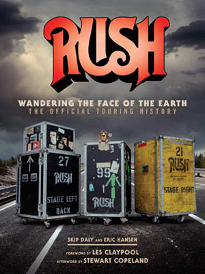
Hello Hugh! I can't believe how long it has been since we last spoke. It was over seven years ago that you, Skip Daly and I discussed ideas for the cover that we commissioned from you for Wandering the Face of the Earth, the Official Touring History of Rush. I was pleased to see you included in The Art of Rush, in the live albums and artworks section.
It turned into one of my favorite pieces. I revisited the piece for a gallery version I did in Austin, where I added a sign saying there's people walking across the road. And of course, I put three figures on the sign, and I put a different background with pine trees and so on. It looks different, I just felt like tweaking it.
I did the same thing with Hold Your Fire. I've regentrified that little neighborhood that I built as a tabletop model, that was a miniature of a city that the juggler would stand in. It was fun to do. The car is different, you can actually see Neil in the diner, I repopulated the loading bay on the left, and even the flames on the juggler's fireballs are different. It's kind of a Where's Waldo thing, even the brick on the road is different now. So, I just got into it; once I started doing it, I couldn't stop myself. It's not like it's unrecognizable; it's still the same base moment in time, it's still based on the miniature that I built of that city, but there's probably about 30 or 40 different tweaks and embellishments that I enjoyed indulging in. It's been tweaked with everything from a pigeon on the ledge to flower boxes, the activities in the window above the diner are different now.
Maybe we'll get to see that in the Hold Your Fire 40th Anniversary Edition?
Oh, absolutely. After I did it, I realized unwittingly, I had created something new for that. That's definitely going to appear in that 40th Anniversary piece. But in the meantime it is part of my gallery shows, because it's kind of cool.
Speaking of the 40th Anniversary packages, I assume that you're working on Moving Pictures. Have they indicated at all how long they're going to be doing the 40th Anniversary releases?
I don't presume... I've often said to people who say, "So you're the art director for Rush?" and I say, "As it turns out, yes, I have been." But I'm always careful to point out that when Neil called and he would presumptuously say, "Drop what you're doing, it's time to work with Rush," and it was all in that kind of humor that I loved about them, and particularly him. But I would listen to the arc of his album theme, or we would just discuss the title and I would hang up and I would try to find that same excited enthusiasm that I had when I was 20 years old when I first started doing covers for them. And I also hung up with that same kind of gratitude. I made a point of not assuming that I was on call and I was their art director. Don't get me wrong. I'm not being coy either. Because I know as time went on, and I played on their albums, and I was kind of the guy they seemed to be coming back to, I appreciated that loyalty. But I still hung up on those calls with that sense of "Yes, another great opportunity to work with these guys." It kept me humble but also kept it kept the process fresh.
You're coming out with the expanded and updated edition of The Art of Rush: Serving A Life Sentence, and in paging through it and comparing it to the first edition, was this mainly a case where the original printing had sold out? And if so, when you put together this edition, did you primarily update it with what had been released since then?
Yeah, we made an addendum. We didn't invade the main part of the book, or insert the new art throughout the book. We actually treated the new art as an offshoot of having done these 40th Anniversary box sets. And I thought, "Well, we either wait for another 40 years where I will be 109 years old, or we at least feature some of the 40th Anniversary artwork." We did 2112, A Farewell to Kings, Hemispheres, Permanent Waves, currently working on Moving Pictures... But we leak the artwork for Moving Pictures into this book. And it was our plan that the Moving Pictures 40th Anniversary box set would be bootstrapped to the book, and it would all come out at the same time. But unfortunately, and I'm not sure if this sits well with the record company, but there were some production issues during the pandemic.
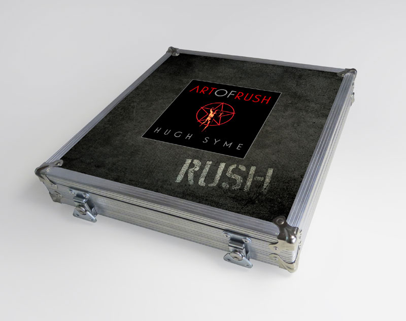
The first edition was underwritten by Rush themselves which was a great vote of confidence. This one is being distributed by IDW, which is a huge publishing company. For me to have this book coming out now, which is going to be handled by IDW and finally going to distributed in England, in Europe and Asia and elsewhere, is great. Rush has a tendency to believe that if you build it, they will come. Well, that's true. But my book could have sat at Rush Backstage for a few years, but it finally sold out. I'm grateful that it did, and it wasn't a cheap book to buy. For the first printing we did a limited Roadcase Edition, and the band said, "Yeah, we're gonna sign it," and I designed the roadcase, which was a bit over the top. I asked Patrick McLoughlan [Rush Backstage Club], "So, what do you think you could sell that for?" and he said, "Oh I don't know, at least $1,000" I said "Are you nuts? Who's gonna pay 1000 bucks?" I kind of got where he was going with it, as it sold out in 28 minutes.
It is a beautiful book, and has thick, quality paper. The book itself is like a museum archive.
Yeah, thank you. I'm glad it rose to the occasion, and we won awards. We won the Sappi paper North American Art Book Award for that year, so it wasn't lost on those that pay attention to varnish and embossing and foil stamping and all that cool stuff. So, we went to the mat on that, just because I'm a "gimme gimme" art director; you give me an inch I'll ask for a mile. And apparently I was allowed the mile.
Besides your work on this book, how else have you stayed busy during the pandemic?
I have also been doing a podcast called Music Buzzz (www.musicbuzzzpodcast.com) with Dane Clark, who's the drummer from Mellencamp's band and also Andy Wilson, formerly with Live Nation. Now Andy has his own company called Elevate Entertainment Services, but his main clients are now his former employer, which was Live Nation and also Anderson Cooper. He sort of adopted me at my gallery show that I did in Indianapolis a couple of years ago, and that led to us deciding to do a podcast. We've had a huge amount of success with the people that are willing to talk to us. We did one where we talked and we introduced ourselves, and then we spoke to Larry Gowen my dear old friend, Kyle Cook (Matchbox Twenty), Steve Hackett (Genesis), Bruce Kulick (KISS), Don Barnes (.38 Special), Nils Lofgren, Roger Joseph Manning, Jr. (Jellyfish), Rick Richards (Georgia Satellites), Kevin Mark (Candlebox), Jim McCarty (Yardbirds, who I arranged strings and play guitar and piano on a project of his), Dave Burgess, Rudy Sarzo, Bill Gibson, Doug Gillard, Donna Jean Godchaux (Grateful Dead), Don Brewer (Silver Bullet Band), Steve Sybesma, Jerry Shirley (Humble Pie), Chris Hillman (Flying Burrito Brothers, The Byrds), and we have Peter Frampton queued up for a few weeks from now, too. All these people are availing themselves to our podcast because they've enjoyed the past podcasts that we've done enough to say "Yeah, we'll be a part of that." So, it's been exciting. It's been a great way to spend a very surreal year. Though I am a seasoned hermit, a workaholic that is no stranger to isolation, having this has been fun.
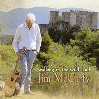
You mentioned working with Jim McCarty. I assume that was his recent album Walking In The Wild Land, which was produced by Terry Brown and besides yourself also included Alex Lifeson as a guest musician. Can you tell me how reuniting with Terry on that project came about?
Terry Brown called me up and said, "Hugh, I'm working with a fellow from the south of France, and he's got some really lovely songs, and it's quite intimate. It's just calling out for strings and maybe some acoustic guitars and piano" and I said, "Send me the track." So, he sent me three or four tracks, and I just dove into it. He didn't tell me who it was. And I delivered it about six weeks later, and a short while later he called and he said, "Oh, he loves it. We absolutely love it we're gonna use it as is. We're not going to edit anything" and I thought "Oh great, job done."
A few weeks later, I went to a garden party at Terry's, and he comes up to me with another gentleman and says "Hugh, I'd like you to meet Jim. Hugh Syme, Jim McCarty" and I looked at him and I said, "You've got the same name as the drummer from The Yardbirds" and he laughed and he said "I AM the drummer from The Yardbirds, and by the way, loved the strings. Loved everything you did on my tracks." And I said, "Wait a minute" and I looked at Terry and he said, "Gotcha!" I said "Why did you not tell me?" And he said, "Because if I told you, you would have approached it differently, you might even have been intimidated by working with a Yardbird." And I thought "I probably would have."
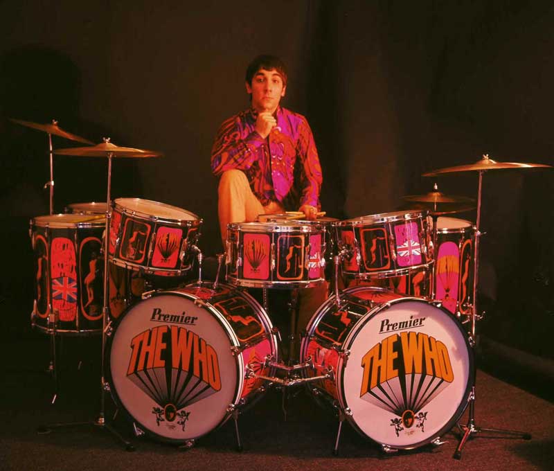
I love the fact that my father bought me Premier drums when I was 12 years old when we first moved to England, where I lived for almost six years in the 60's. And when I finally realized that Ludwig drums from Chicago were prohibitive because of duties and import taxes and so on, I thought I had to "settle" for Premier until I watched Ready, Steady Go! one day. I saw the Yardbirds drummer play Premier, and Keith Moon played Premier and I thought "I'm happy to own these drums." And then at age 13, I'm out playing in a cover band, songs like "For Your Love" and "Heart Full of Soul". So, fast forward 35 years now, I was really delighted to tell Jim McCarty that I had enjoyed playing Premier drums as a kid for the better part of eight years.
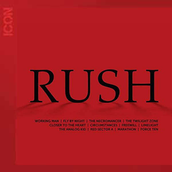
On September 9th, the Cinema Strangiato "Director's Cut" aired in select theaters world-wide. Before the movie, sort of as a preview, we were treated to a CGI animation with photographic proof-like images of various Rush album covers that led to the announcement of what appeared to be reissue of the ICON greatest hits album. Were you a part of putting together that animation?
No, no, I wasn't. Early on I was involved in helping develop the animation, but I can't be everywhere. I do the foundation artwork from which they usually harvest their imagery. They take my layers, or they go off and do something based on my artwork. It's hard enough doing what I do.
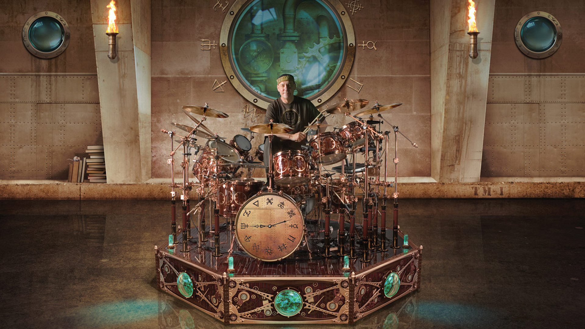
I worked with Neil on developing the look and feel of his drum sets, we'd talked it over even though it was physically put together by the manufacturer of the drums. The portholes in the riser with the TVs and so on, that was all stuff that I indulgently said, "We've got to make that riser also come to life." I asked him to put fish swimming behind them, and any kind of imagery that would just rotate, and I thought they worked out well. That's a relationship I'm going to forever miss. He was wonderful.
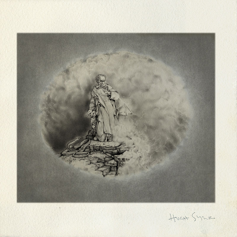
You've talked before about how Caress of Steel went south at the printer, and you've also said that you weren't at the press check for the original printing of Grace Under Pressure and they got the colors all wrong. I know you corrected Grace Under Pressure on future reissues, starting with the "Rush Remasters" and later with Sector boxed sets, but what about Caress of Steel? Did you ever consider making that corrected to your True Vision, your original vision, on future reissues?
Well, I did do that in the Roadcase Edition of the first printing of The Art of Rush; they did include two lithos of my pencil drawings.
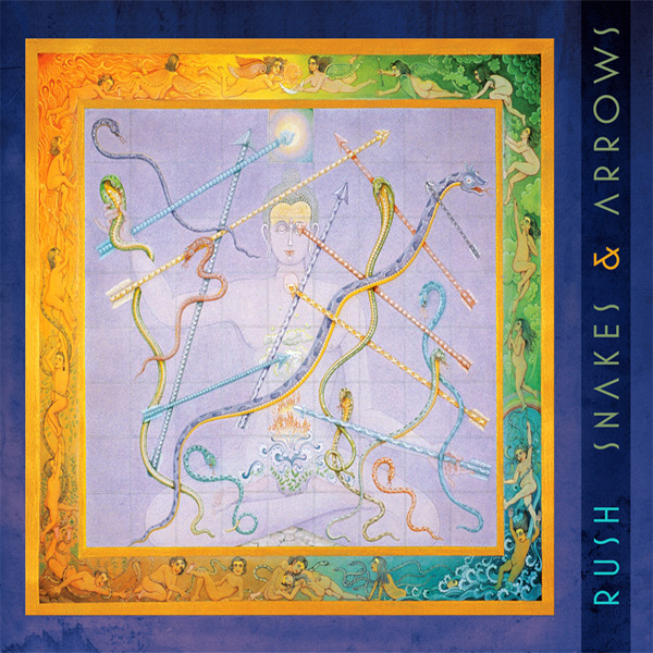
My understanding was that you originally intended it to have a bluer background with Chrome lettering instead of Bronze?
Oh, no, no, no, no, no, no. My inspiration at the time, I was only 19, and I went to a small art school in Toronto for one year above the Poor Alex theater. I was such a fan of MC Escher, and he had done a lecture at our school. So, I did meet my hero, and he was an unparalleled draftsman. He drew beautifully. He did great stone and copper litho etchings and I was very inspired by his pencil drawings.
I loved drawing with pencil, so my first goal was to bring my pencil drawing to life on the cover. My intention was that this be just a beautiful, nice pencil drawing on a real confidently minimal cover. And I think they felt it was too "confidently minimal" and decided to "gussy it up" at AGI in Chicago after I delivered it to Mercury. Blue was added by the label! Chrome was added by the label! Look at look at the way that blue is cut with a sharp edge! If I wanted blue, I would have feathered it in with an airbrush! I would have done something artistic, but it was just like cut film. And it was just awful.
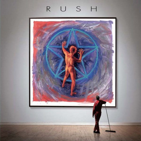
It didn't seem to hurt my career and apparently it's still some people's favorite cover. I liken it to the young girl with the chrome airplane on Blind Faith. It's a terribly executed, technically speaking, cover, but a very impactful cover. A very timeless cover. And I think sometimes music is memory, and so it art. Memories become part of our soundtrack and our backdrop to our life. If people love that album for whatever reason, and embrace the cover, inclusive of all of its shortcomings or unwelcome embellishments, it's all part of it. I haven't lost sleep over it. So that was going to be a very different cover, but the lithos inside the Roadcase Edition salvage some of that integrity, it brought it back to its original form a little bit, which was nice for me, personally. But now to reissue it with a different cover? That's about as reissued as we're going to get, that we could do the lithos in that boxed set.
When the band saw it they said, "What the hell is this?" and I said, "I don't know." That's when the band stepped in and said, "A&R people cannot come to our studio anymore. We don't care about the opinions of anybody at the label. We're going to do our music and deliver it the way we want." And that began their process of insistent autonomy, and when they found out that people were meddling, and sometimes even, even the manager would try to make suggestions... Ray Danniels didn't like my idea for a dog sniffing a fire hydrant, for example. I told the band and the band told Ray, "we don't care." So, it was it was a wonderful band to work with on that level, because the autonomy that they demanded for themselves was also extended to me.
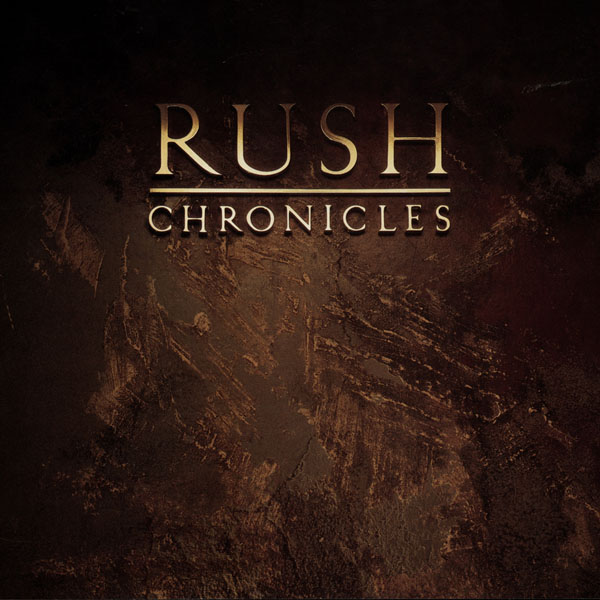
Can I ask you about the Chronicles cover? That was 1990, it was Rush's first all inclusive career spanning compilation, and what has always struck me was that the starman was not on the cover. I've always wondered if that was something you did not want to include on the cover to simplify it, or perhaps the band didn't want the starman on there? Do you remember back then? I realize it's been 30 years!
Generally speaking, as much as I appreciate the fact that the unwitting icon of the starman, I mean it became the band's thumbprint, it became the Playboy logo to Rush. But as an art director, even though I continue to marvel at and appreciate the fact that my rendering of the starman became so famous and I'm glad I'm the guy that created it, you get a little burnt out on repeating that everywhere. When I did Archives, I used the starman and it made sense. And, I snuck the starman on the barn in "Red Barchetta" [for the Moving Pictures 40th Anniversary edition] very faintly weathered and almost indiscernible but it's there. When I revisited Hold Your Fire with the juggler as we discussed earlier, I added some graffiti in the alleyway and faintly visible is the starman on the wall. So, there are times when I resurrect the starman in places where you probably wouldn't expect it.
Chronicles wasn't a throwaway, I still wanted it to look good. But I didn't feel connected to the catalog that that particular project was going to represent. I didn't really talk to the band about it. Neil once said, "I really don't like talking about rereleases and stuff like that, to me that's on the label" and so on. So, the detachment of the band from those instances, I guess it kind of permeated through how I felt about it. I didn't feel as excited about those projects, to be quite frank. I still wanted the image to feel right and to serve the band well, but we didn't have any insightful discussions about what the cover should convey, I feel, like we would with a regular album project.
That makes sense. The Chronicles cover always reminded me of what you might see behind the front desk at a law firm. You've got the marble wall with the raised metallic lettering...
I guess there is something kind of formal about it; formal yet distressed. It was a precursor to the marriage of iconography. And now you do see a lot of logos as you come into offices, whether it's a law firm or a design firm. A lot of people, including my daughter's insurance brokerage, their half wall by the receptionist has a logo floating in front of it that I designed with LED lights shining back on the wall, but the wall is completely distressed concrete. I don't mean to say I was ahead of my time, but sometimes you design for the sake of design.
It's much like the nut and bolt for Counterparts. When I told Neil about how I thought that would be a cool cover, he did get a little quiet and said "Yeah, that's really minimal". I said, "But we could still indulge in all the salt and pepper, Yin and Yang, tortoise and hare, slap and tickle, lock stock and barrel"... We spent three months faxing and phoning each other with all of our contributions to that prayer that went inside, which was that long list of word pairings and that to me is "counterparts". So yeah, it was a time just to have fun. And that the cover was something that took a little... he had to sleep on that one. But it ended up being one of the best selling t-shirts Patrick [McLoughlin, Rush Backstage Club] has, so you just never know.
When you put together the Retrospectives I and II covers, with the museum walls and the janitor pushing a broom, those are much more elaborate than Chronicles, yet they only came out about 7 years later. It's almost like you did a 180 and decided to put together a more elaborate package for those.
Yeah, I guess maybe I unwittingly or subconsciously thought "Chronicles was a bit too retiring, let's do something that celebrates a little bit more." We brought the man in the red back because Moving Pictures had red janitorial overalls and yeah, I guess that that was like you said, it was enough time later that I got to kind of, in a self-serving way, create a gallery of my own work. Which was not a bad place to be for someone who's been so fortunate to have the loyalties of a band like Rush.
Was there ever an idea that you pitched the band where they shut you down and said "absolutely not", because it was too outlandish?
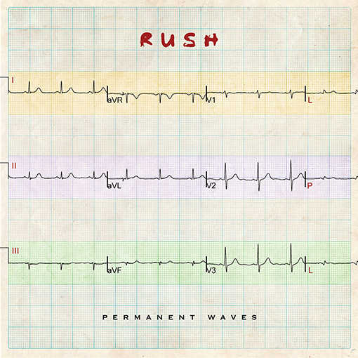
I was shown the door, sort of, and it wasn't like "get out of here!", but Permanent Waves was not initially what I finally created. In that first conversation, I had talked to the band about letting me bring in three medical techs to do electroencephalograms of their brainwaves and their heartbeats and just to create a profile of each person's physiology, and a measure of music during the recording. And then in the booklet, it would say that that's how Geddy's heart and brain was depicted during bar four of such and such a song. It would have been an interesting cover to see three isolated, biometric graphs of their vitals, their physiology.
So, the guys were embracing that as a pretty cool idea, but then I mentioned "You know, we could have a woman with a permanent wave hairdo walking out of a tidal wave, maybe with some kind of political faux pas", and I meant Dewey defeats Truman. There's a wave to how the news travels, and that particular piece was truncated by the fact that 60,000 presumptuous headlines were printed and scrapped because Dewey didn't defeat Truman. And we did have someone in the background waving [i.e. Hugh himself]. And I remember some comment like "Yeah... don't call us, we'll call you...give your name to the girl at the front and we'll be in touch." So there was a bit of a dismissal.
And then Geddy called me, surprisingly, a few days later. "You know that girl in the tidal wave? We think that's pretty cool. Let's do that." Of course, I hung the phone up thinking, "God, how am I gonna do this?" So, I called Flip Schulke down in Mobile, Alabama. He was a Time-Life photographer that photographed disasters, and he would strap himself to telephone poles in pretty hazardous places to get the best photo. That wave crashing over the bathhouse in Galveston was his shot. I called him and when I did call, his wife answered the phone and said "he's here, but he's up on the roof right now. He's trying to dig a tree out of our attic, we had a real bad hurricane." And I thought, "Oh, how ironic," they had just suffered through some hurricane damage. When we did talk, I told him what we had in mind, we really wanted to have a dynamic photo, and I saw a photo of his I wanted to use at a stock house. And he said, "Well, no, don't deal with a stock house, let me just send it to you, I got a nice big print of that you could work with" and I said, "so what would that cost?" And he told me some outrageously fair and kind price and I thought, "am I ever glad I called you," because budgets were an issue at the time. The band wasn't so big, they weren't Pink Floyd, they weren't calling up Storm Thorgerson who would tear through tens of 1000s of dollars of Floyd's money. So, I was grateful for that. He was the one that made the one part of that cover that I was worried about achieving possible. He solved that problem. To this day, I'm so grateful for him.
Did the band ever make a request for a cover idea that, by the same token, you said, "No, that'll never work?" Or "Here's why you shouldn't do that"?
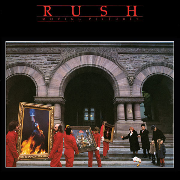
No, they never did. And, again, I'm grateful for the autonomy and the freedoms and the trust they placed in me. When I called and said "Moving Pictures? What a great title! You could have men moving pictures!" Again, they kind of all went quiet. "And we gotta have some people at the sidelines, probably some kind of family in Bolshevik attire." And I ended up meeting the parents of a hairdresser that I knew that worked at Vidal Sassoon at the time, and her parents and her nieces were the kids. So it was layered with levels of motion, movement, moving, moving pictures, the emotional moving and the motion picture crew.
Did the band ever come to me with ideas that I didn't like? The only time my nose was out of joint a little bit was on Snakes & Arrows. I even got a call from my good friend Chris Herin, wonderful guitarist in the band Tiles (who Terry Brown produces), who was way more into social media than I ever was. He called and said, "Have you seen the blogs and all the people that are really disenchanted by this board game for "Snakes & Arrows" that anyone can buy on Amazon [being used as the cover]".
Obviously, Neil had access to this dangerous frontier called Google, and he tapped into something that spoke to him. I did share the blogs with Neil and said, "I'm not saying this for the self serving standpoint, but fans don't seem particularly keen on the board game cover", and he said, "Well, when those guys form a band of their own, they can make those decisions for themselves."
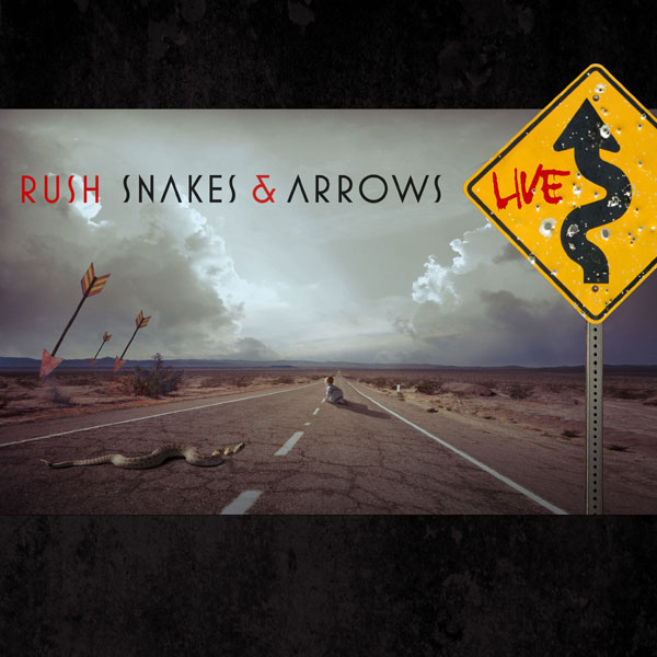
I thought, "Okay. I hope this isn't the beginning of a new structure to our relationship!" And it wasn't; it was just a one off. But one of those blogs said, "I hope this is not an indication that Hugh Syme is going the way of Terry Brown." And I can't pretend that that didn't occur to me too, because throughout my career I thought they could meet a watercolorist in Japan that they like, or they could meet some fancy fantasy painter in Hamburg, Germany that just appeals to them. I never ever told any interviewer, I never presumed myself secure, never presumed until enough covers went by that I felt like I was their director, I was Rush's Roger Dean, you know? It was getting clearer and clearer that we had that alliance, that dynamic.
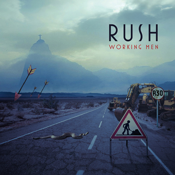
Your version of the cover appeared in the liner notes, as well as in a slightly altered form on the covers of both Snakes & Arrows Live and Working Men. It is also on the museum wall instead of the game board version on the Retrospective 3 cover.
Right. When that cover happened, I was still determined that the CD booklet and the LP and other parts of the project would still feature the cover I would have done for them. And even Neil got that and said "Ooh, I see that the slipcase carries the cover that I wanted", which was the Harish johari watercolor, "but I see you managed to get your licks in on the CD booklet, which I really like, it's a good cover, too!" He was both amused and pleased with the outcome of that.
The only other time where I felt I was being treated like the commissioned artist was the Power Windows cover painting. I thought the boy alone in a room by himself controlling the world with the remote control was poignant enough. We did talk about the Marshall McLuhan expression that "the media is the message". At that time, which was way before cellphones, I said, "Our real window to the world was TV, so that's a powerful window", and everybody kind of said, "Yeah, what a cool idea, but maybe put a couple of TVs in the background". I said, "Yeah, but the room being empty was much more important". So I finished the painting without the TV's because I thought it would look better, just being a poignant, very lonesome room. When I delivered it, they all voted, and then Geddy, who had come up for air from all the recording and work that he was doing, said, "Yeah, it looks great, man. But where's my TVs?"
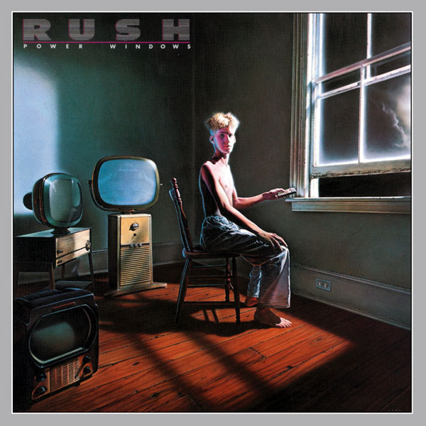
I did some research and I found a store called the Red Indian on Queen Street in Toronto that sold art deco. I found three beautiful TVs and thought, "Well, if I'm going to put TVs on there, they're not going to be from the Lucy & Desi era, they are going to be even older than that," so I photographed them as reference. And then I re-gessoed the canvas, which was really painful to do. I had to go back in and basically draw exactly where the TV's were going to go, and I had to tape off where I was going to begin the work. This was way before Photoshop, which would have made that task a breeze, I could have done that so easily! But I had to gesso the canvas and isolate a newly painted area. Gesso is a white chalk-based primer, which you put on the canvas, so you start from scratch. The baseboards and the lighting, all that stuff that was in there, I had to obliterate with gesso and then paint in the TVs. So, in a way I was a little bit miffed. It's a painting that to this day is very dear to me because my father was in the last throes of his life and fighting emphysema. He passed away in the middle of doing that painting, so I can't think of that painting without harkening back to that era that was about 10 weeks of work. A long stretch of work. But I really loved doing the painting. I was excited about the fact that, like Grace Under Pressure, I had an opportunity to do another painting. I don't always have the time to unplug for two to three months to do a painting, which I do love doing.
You mentioned Photoshop. I know that has made your life as an art director easier, but I think your work is unique because you still have your original skills. I think that you're able to put those to use even when, if you're using the new digital tools, you still have the background knowledge of how it used to be done, which enriches the experience.
Yeah, thanks for making that observation. I see a lot of photographers that do cobble together disparate images in the effort to make something unlikely or surreal or improbable. And there are some that bring the sensibilities of illustration and the understanding of light and so on, and some don't. A lot of times it feels like retouching, it doesn't feel like a cohesive concept that's been realized, which is what I always aspire to do in my own work. Not to say that there aren't some brilliant digital artists out there. It's even been gratifying to me, I got a call from a friend saying, "I love the new Pink Floyd cover you did," and I said, "What are you talking about?" and he sent me the screen capture of the man standing in the rowboat in the clouds from Pink Floyd's The Endless River. And I thought "Oh, yeah, great piece. It does kind of look kind of look like my work". Well, someone assumed it was.
I just have one final question. What is your favorite album cover? Other than a Rush cover?
Oh, there are many, for different reasons. I've always maintained that music is memory. Music does, unwittingly and automatically, permeate into the fabric of who we are and what we're doing at a given time. When The Mamas and The Papas' "California Dreaming" came out [from If You Can Believe Your Eyes and Ears, 1966], my mother was ill with cancer, and she passed away not long after. So, I can't hear that and not think of her. I'm not saying that cover is my favorite, it's a portrait of the people in The Mamas and The Papas. But the same way that, as I say, music has memory, so does art. I can't listen to Elton John's Mad Man Across the Water without remembering laying on the floor in my family's living room after I would turn the speakers in towards my ears and just have real life live headphones on both sides as I was lying there. I think Sgt. Pepper's Lonely Hearts Club Band was pretty brilliant... crude but still brilliant. I think the White Album was super cheeky, and clever; a cover that only the Beatles could do. Only the Beatles had the gravitas and the esteem, to say with the White Album "We are the Beatles, we can do what we want, and we are all about the music" which was the way I looked at that cover. The Dark Side of the Moon is simplistic and powerful. Wish You Were Here, I love the ridiculousness of that cover. There's no favorite, there are many that speak to me.
Back to my earlier point, you can't disassociate an emotional response from artwork or imagery or eye candy. I even told my ex-wife, which I probably shouldn't have because it pissed her off... She wasn't ever a true Beatles fan really; I remember thinking "Good thing you like dogs, because if you didn't like dogs and the Beatles, we couldn't be together". But I remember telling her that I was going to parties at age 13 in the UK when Sgt. Pepper's came out, and I joked and said how I can't hear "Lucy in the Sky with Diamonds" and not remember how I was mastering the feat of unhooking a girl's bra strap. And I was at that curious age, you know? And after I made this comment, anytime the Beatles came on the car radio she would turn them off! So, we can't disassociate images of what we were doing at a given point in our life when we hear an album. Art affects us on all levels way deeper than we even know.
The Art of Rush: Serving A Life Sentence, published by IDW, is hitting shelves everywhere books are sold on October 12th